


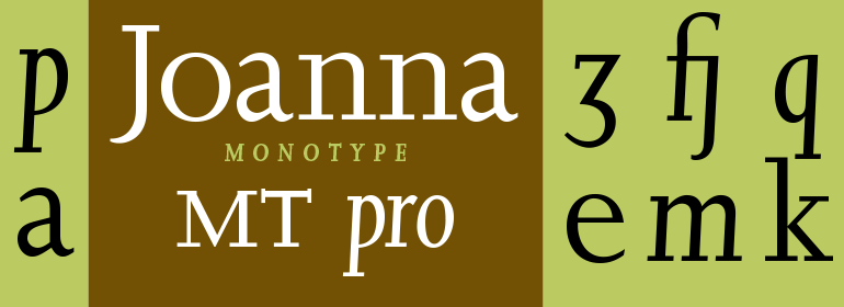
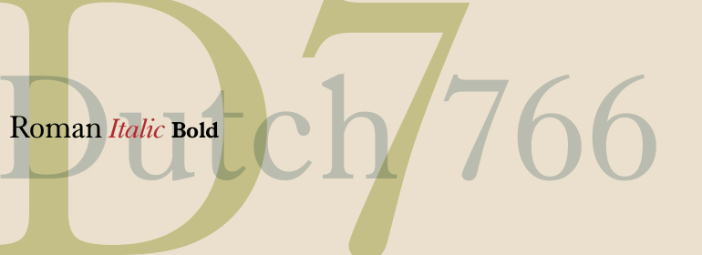


FF Unit® Slab
方正字体说明
FF Unit® Slab.TTF
字体英文名称:UnitSlabScOffcPro-Thin.TTF
FF Unit® Slab
品牌:FontFont(Monotype)
设计师:
Spiekermann,Erik; Schwartz,Christian; Sowersby,Kris
发行时间:2018
字库编码:
Unicode
分类:
衬线体
字体属性:
字体介绍
Dynamic Super family in Sans, Slab and Rounded versions_x000D_
Designed by Erik Spiekermann and produced by Christian Schwartz, FF Unit? can be said to represent an adult, more reserved sister of FF Meta?. This neutral super family has three styles that make it perfect for use in larger scale projects.Originally conceived as a variant of FF Meta and as the house typeface for Spiekermann's "United Designer" studio, FF Unit soon took on a life of its own and became a separate super family. _x000D_
The characters of Unit, in comparison with those of its sister Meta, are somewhat more compact and it is apparent that their basic forms are based on that of the superellipse so that they are not dissimilar to a modern square sans. In addition, Spiekermann has abandoned the calligraphic allusions to be found in Meta, such as the slightly oblique finials of the "h", "l" and "n" and the bowed spur on the "a", "b" and "d", although these two style elements are retained in the italic variants. When contrasted with Meta, _x000D_
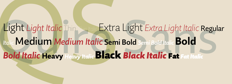
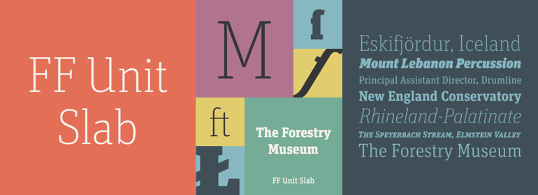
FF Unit thus appears slightly more squat and reserved but by no means boring despite its more reticent character. And there are numerous alternative characters that can be used to vary the appearance of text in special situations, such as in headlines. For example, there is a single-story "g", a closed "a" and an uppercase "M" with diagonal stems. FF Unit is available in seven weights, from Thin to Ultra, each accompanied by the corresponding italic. In addition to the sans serif variants, Spiekermann has also created styles with rounded terminals - FF Unit Rounded - and a slab serif version - FF Unit Slab. _x000D_
_x000D_
FF Unit Slab_x000D_
This condensed slab serif was designed by Christian Schwartz and Erik Spiekermann more or less in parallel with Meta Serif with the intention of ensuring that the two would mutually complement each other. While the somewhat more lively Meta has all the attributes of a traditional antiqua font, the forms of Unit are much more consistent with the more formal outlines of a slab serif. The lowercase "i" and "j" of the sans version already had tiny slab serifs that could be readily adapted for the other characters. The slab variants are also available in the same seven weights as FF Unit, also with the corresponding italic versions._x000D_
FF Unit RoundedWith the aid of the Superpolator software developed by Erik van Blokland, Spiekermann and Schwartz designed FF Unit Rounded, a font consisting of only two styles that was commissioned by a customer. The rounded terminals needed to be individually adapted for each stroke weight to ensure that the warm and friendly character of the font could be appreciated to its best advantage without it appearing sausage-like or being hijacked for use in comic books. The individual character of FF Unit Rounded is particularly evident when it is used in larger point sizes.In contrast with the other two members of the super family, FF Unit Rounded does not have the Thin weight or the italic variants._x000D_
The FF Unit super family will provide you with the tools to master all challenges. The fonts can be used, for example, for major tasks such as creating a corporate identity for a company. With the perfect typographic support and the condensed, elegant or powerful bold fonts you will always be able to find the right tone. Not only can the various FF Unit styles be readily combined with each other, there are also attractive options for use together with Unit's sister, FF Meta.
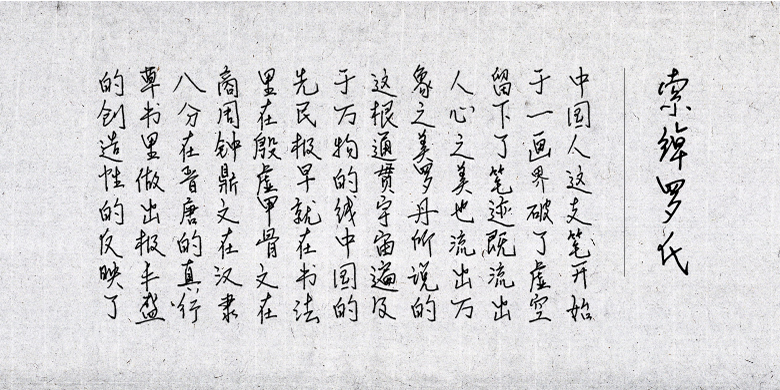
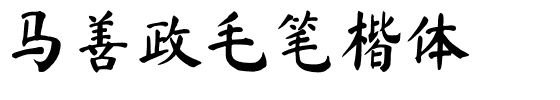
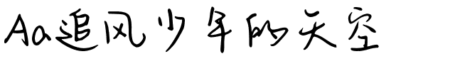
书法字体下载地址
特别提示
1、本站所有资源仅供学习与参考,请勿用于商业用途,否则产生的一切后果由您自己承担!
2、如有侵犯您的版权,请及时联系,请来信978767986#qq.com(请将#换成@发送邮件),我们将尽快处理。