


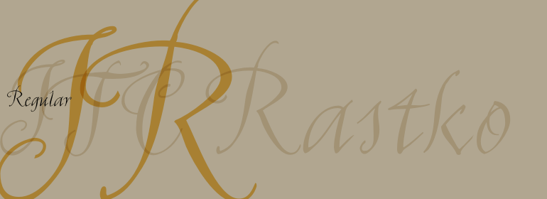


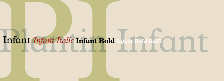
Plantin® Infant
方正字体说明
Plantin® Infant.TTF
字体英文名称:PlantinInfantMTStd.TTF
Plantin® Infant
品牌:Monotype
设计师:
Pierpont,Frank Hinman
发行时间:2018
字库编码:
Unicode
分类:
字体属性:
字体介绍
Plantin是Monotype在1913年创作的一种文本字体家族。与其同名者Christophe Plantin (荷兰语为Christoffel Plantijn),1520年出生于法国。1549年,他搬到了安特卫普,位于现在的比利时。1555年,他在那里开始印刷工作。他还曾在荷兰莱顿大学(University of Leiden)短暂工作过。Christophe Plantin在书中所使用的字体对排印发展的未来起到了启发作用。
<br>
1913年,英国Monotype公司的经理Frank Hinman Pierpont主导了对Plantin的复刻。根据位于安特卫普的Plantin-Moretus博物馆中来自16世纪的样本,特别是Robert Granjon的一款刻字和一款连笔意大利斜体, Plantin字体才被构思出来的。Plantin是为了用于国际出版市场的机械排字工作而绘制。
<br>
Plantin以及启发它的历史模型都是具有法国风格的老式字体,但是其x字高比Claude Garamond的作品要大。Plantin将继续影响另一种Monotype的设计,Times New Roman。Stanley Morison和Victor Larent在造字时以Plantin作为参考。
<br>
和Garamond一样,Plantin字体非常清晰可辨,给人一种经典优雅的感觉。Plantin确实是一款非常随和的字体。字母的笔画和衬线造型牢固,使字体的整体外观比以往更强; 没有细窄部分保证了其在铜版纸上的良好效果;另外,字母结构紧凑且不需要改变大小,使Plantin成为使用中最经济的字体之一。简而言之,它本质上是一款通用字体,非常适用于期刊或碎件印刷,且在许多书籍和杂志出版中非常有效。尤其对Plantin的粗体字重做了优化,以提供充分的对比:通过对衬线进行轻微的锐化来避免了笨重。
<br><br>
Plantin is a family of text typefaces created by Monotype in 1913. Their namesake, Christophe Plantin (Christoffel Plantijn in Dutch), was born in France during the year 1520. In 1549, he moved to Antwerp, located in present-day Belgium. There he began printing in 1555. For a brief time, he also worked at the University of Leiden, in the Netherlands. Typefaces used in Christophe Plantin's books inspired future typographic developments.
<br>
In 1913, the English Monotype Corporation's manager Frank Hinman Pierpont directed the Plantin revival. Based on 16th century specimens from the Plantin-Moretus Museum in Antwerp, specifically a type cut by Robert Granjon and a separate cursive Italic, the Plantin" typeface was conceived. Plantin was drawn for use in mechanical typesetting on the international publishing markets.
<br>
Plantin, and the historical models that inspired it, are old-style typefaces in the French manner, but with x-height that are larger than those found in Claude Garamond's work. Plantin would go on to influence another Monotype design, Times New Roman. Stanley Morison and Victor Larent used Plantin as a reference during that typeface's cutting.
<br>
Like Garamond, Plantin is exceptionally legible and makes a classic, elegant impression. Plantin is indeed a remarkably accommodating type face. The firm modelling of the strokes and the serifs in the letters make the mass appearance stronger than usual; the absence of thin elements ensures a good result on coated papers; and the compact structure of the letters, without loss of size makes Plantin one of the economical faces in use. In short, it is essentially an all-purpose face, excellent for periodical or jobbing work, and very effective in many sorts of book and magazine publishing. Plantin's Bold weight was especially optimized to provide ample contrast: bulkiness was avoided by introducing a slight sharpening to the serifs' forms."
书法字体下载地址
特别提示
1、本站所有资源仅供学习与参考,请勿用于商业用途,否则产生的一切后果由您自己承担!
2、如有侵犯您的版权,请及时联系,请来信978767986#qq.com(请将#换成@发送邮件),我们将尽快处理。