


Quire Sans™
方正字体说明
Quire Sans™.TTF
字体英文名称:QuireSansPro-Regular.TTF
Quire Sans™
品牌:Monotype
设计师:
Ford,Jim
发行时间:2018
字库编码:
Unicode
分类:
字体属性:
字体介绍
Quire Sans: a universal, humanist sans serif from Jim Ford
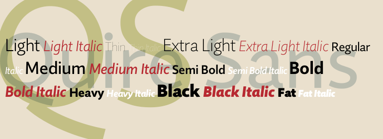
Jim Ford has put all his experience as a font designer into the new humanist sans serif Quire Sans in order to create a perfect font. Easily legible letters with plenty of character and ten weights make this new font a true polymath.
Ford began designing Quire Sans with the intention to create nothing less than the "sans of all sans". After many years of research and experience in font design, as well as the design of countless customer fonts, Ford wanted Quire Sans to be the font he had always imagined, but never dared to start. With Quire Sans, he draws on various epochs of font design, blending Dutch, Italian, French, American and English influences with his personal style. The name itself goes far back in history: "quire" referred to a defined number of pages in medieval book production.
As a humanist sans serif, the shapes of Quire Sans are based on Renaissance Antiqua and demonstrate the typical letter forms and variations of this font genre. The "a" is open and the "g" is two story; the one-story version is included as an alternative character
.
Carefully, almost invisibly slanted terminals on the stems, legs that curve outwards slightly on the uppercase "M" and round dots take off some of the formal edge of Quire Sans and lend the font a loose, almost joyful character. Another detail supports this font personality: The diagonal arms - in "k", "A", "K" and "R", for example - are cut so as to be on a slight angle and only touch the ascender line with a point, appearing as if they were taking a step.
Ford is very careful not only with the design of the letters, but also with the selection of characters. Quire Sans has character sets with medieval and upper-case characters, aimed at table and proportional setting. Moreover, there are small caps, numerous f ligatures, an alternative &-character and the fleuron.
Each of the subtly graded weights of Quire Sans has true italic styles that draw on the Antiqua even more. Here, numerous letters have a light, curved, dynamic shape, like the "k", "v", "y" or "z", for example. The lower-case "a" changes to a closed shape, the "f" gets a descender and the "g" switches to the one-story variant - the two-story "g" is still available in the alternative characters, however.
Quire Sans lives up to its aspirations of being a good reading font (which the name itself implies). It is perfectly legible, even in the smaller sizes.
Quire Sans is more than a book font, however. With the extensive selection of weights, it is also a great font for headlines and printing jobs. Depending on the context and the weight, Quire Sans can appear subtle, robust or graceful. The font can also do well in the difficult contexts of guidance systems or newspapers. As a universal sans serif, Quire Sans is the ideal partner for large projects and corporate type.
书法字体下载地址
特别提示
1、本站所有资源仅供学习与参考,请勿用于商业用途,否则产生的一切后果由您自己承担!
2、如有侵犯您的版权,请及时联系,请来信978767986#qq.com(请将#换成@发送邮件),我们将尽快处理。