


Times New Roman Small Text
方正字体说明
Times New Roman Small Text.TTF
字体英文名称:TimesSmallTextMTStd.TTF
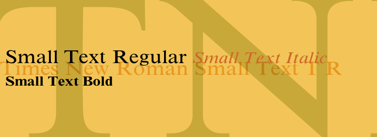
Times New Roman Small Text
品牌:Monotype
设计师:
Morison,Stanley; Lardent,Victor
发行时间:2018
字库编码:
Unicode
分类:
字体属性:
字体介绍
1931年,在Morison写了一篇文章批评《时代》(The Times)印刷质量差且印刷落后于时代之后,《泰晤士报》(The Times of London)委托Stanley Morison和Monotype Corporation设计一款新的文本字体。新设计由Stanley Morison指导,并由《时代》(The Times)广告部门的艺术家Victor Larden绘制。Morison使用较旧的字体Plantin作为其设计的基础,但为了提高可读性并节约空间而对其进行了修改(这对于报纸而言始终是非常重要的)。由于报纸使用的旧字体被称为Times Old Roman,因此Morison的修订版本就成了 “ Times New Roman”。《泰晤士报》于1932年10月首次使用了这款新的字体,一年后,这种设计被用于商业销售。Linotype版本(简称为“ Times”),已针对排铸技术进行了优化,尽管基本设计上的差异很细微。《泰晤士报》使用的字体非常成功,它使用的新闻纸的等级比大多数报纸都高。更好,更白的纸张增强了新字体的高对比度以及清晰的衬线,并产生了一种闪闪发光的现代风格的外观。更好、更白的纸张增强了新字体的高对比度和锐利的衬线,创造了一个闪闪发光的,现代的外观。1972年,Walter Tracy为伦敦时报设计了Times Europa,这是一个更加强健的版本,需要用它来满足报纸印刷的最新需求:更快的印刷速度和更便宜的纸张。在美国, Times字体家族自20世纪40年代以来一直普遍用于杂志和书籍字体。在美国,《泰晤士报》字体家族由于Times的多功能性和可读性,它在世界各地仍然很受欢迎。而且由于它是大多数计算机和数字打印机上的标准字体,因此它已经成为办公室里普遍熟悉的主力字体。Times、Times Europa,以及Times New Roman都特别适合用于提案、年度报告、办公室信件、杂志以及报纸。<br>
Linotype提供了许多版本:<br>
Times New Roman是Times的通用版本,以前用作Linotype热金属整行铸排机。Roman、Italic、Bold、Bold Italic这四种基本字重是大部分打印机中使用的标准字体。还有小型大写字母、老式数字、音标和中欧字符。
Times New Roman Ten是专门为较小文本(12pt及以下)设计的版本;其字符更宽,极细线有点粗壮。Times 10具有许多适合拉丁排印的字重,以及几个适合中欧、西里尔和希腊排字的字重。<br>
Times New Roman Eighteen为标题版本,非常适合大小为18pt或更大的磅值。字符被巧妙地缩窄了,而且极细线也更细。”<br><br>
In 1931, The Times of London commissioned a new text type design from Stanley Morison and the Monotype Corporation, after Morison had written an article criticizing The Times for being badly printed and typographically behind the times. The new design was supervised by Stanley Morison and drawn by Victor Lardent, an artist from the advertising department of The Times. Morison used an older typeface, Plantin, as the basis for his design, but made revisions for legibility and economy of space (always important concerns for newspapers). As the old type used by the newspaper had been called Times Old Roman," Morison's revision became "Times New Roman." The Times of London debuted the new typeface in October 1932, and after one year the design was released for commercial sale. The Linotype version, called simply "Times," was optimized for line-casting technology, though the differences in the basic design are subtle. The typeface was very successful for the Times of London, which used a higher grade of newsprint than most newspapers. The better, whiter paper enhanced the new typeface's high degree of contrast and sharp serifs, and created a sparkling, modern look. In 1972, Walter Tracy designed Times Europa for The Times of London. This was a sturdier version, and it was needed to hold up to the newest demands of newspaper printing: faster presses and cheaper paper. In the United States, the Times font family has enjoyed popularity as a magazine and book type since the 1940s. Times continues to be very popular around the world because of its versatility and readability. And because it is a standard font on most computers and digital printers, it has become universally familiar as the office workhorse. Times?, Times? Europa, and Times New Roman? are sure bets for proposals, annual reports, office correspondence, magazines, and newspapers.
<br>
Linotype offers many versions of this font:
<br>
Times? is the universal version of Times, used formerly as the matrices for the Linotype hot metal line-casting machines. The basic four weights of roman, italic, bold and bold italic are standard fonts on most printers. There are also small caps, Old style Figures, phonetic characters, and Central European characters.
<br>
Times? Ten is the version specially designed for smaller text (12 point and below); its characters are wider and the hairlines are a little stronger. Times Ten has many weights for Latin typography, as well as several weights for Central European, Cyrillic, and Greek typesetting.
<br>
Times? Eighteen is the headline version, ideal for point sizes of 18 and larger. The characters are subtly condensed and the hairlines are finer."
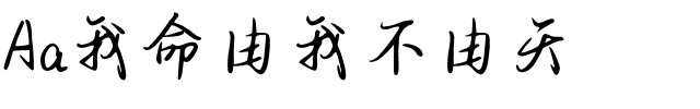
书法字体下载地址
特别提示
1、本站所有资源仅供学习与参考,请勿用于商业用途,否则产生的一切后果由您自己承担!
2、如有侵犯您的版权,请及时联系,请来信978767986#qq.com(请将#换成@发送邮件),我们将尽快处理。