


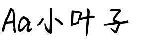
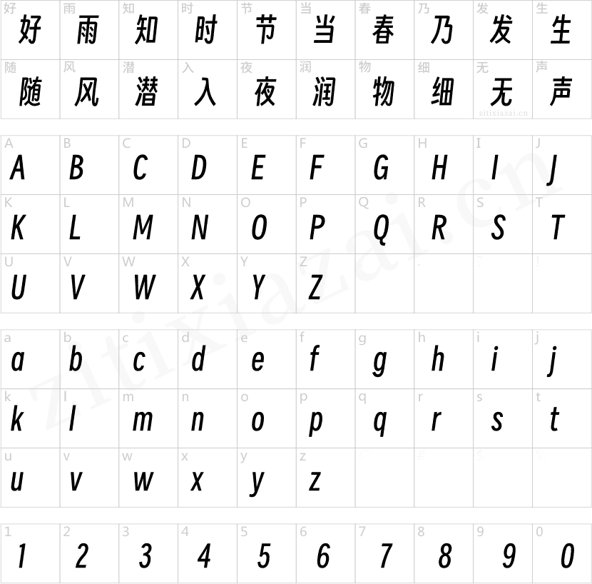


Hope Sans™
方正字体说明
Hope Sans™.TTF
字体英文名称:HopeSans-Thin.TTF
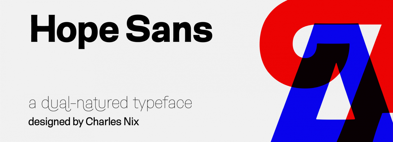
Hope Sans™
品牌:Monotype
设计师:
Nix,Charles
发行时间:2018
字库编码:
Unicode
分类:
字体属性:
字体介绍
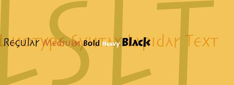
A boatload of personality and a riot of swash characters make the Hope Sans ™ typeface an excellent display family. But this is a dual-purpose face. Hope Sans also does double-duty as a good-natured text design. Every cap letter has at least two swash alternatives, and some as many as six. Several lowercase characters also have swash or alternate characters. Ligatures abound. Underlying all this typographic merriment is a cheerful sans serif design in six weights, each with a cursive italic companion. The result is a typographic paint box that can be used for everything from branding to packaging, and advertising to editorial design. Headlines, subheads, banners and navigational links are naturals for Hope Sans’ lightest and boldest weights – either with, or without, the swash letters. The mid-range weights of the family shine in smaller sizes and in blocks of inviting text copy. Their friendly vibe also translates well to web and interactive design projects. Spacing is open, counters are large, and Hope Sans’ range of weights can provide just the right design for virtually any need. Charles Nix drew on two sources when he began his first sketches for Hope Sans. “I was looking at lettering for inspiration – specifically lettering from the middle of the last century,” explains Nix. “The thing that grabbed me was the relaxed nature of hand lettered forms based on traditional typographic models. I wondered if I could capture some of that spirit and make a lively grotesque.” Nix, however, did not stop there, He wanted to create a design that was more than “just another grotesque.” Hope Sans takes the jaunty style of 1950s and 60s sans serif lettering and combines it with the jubilant 1970s swashes of Bookman and Caslon. The result is a sans serif family that is vivacious and affable. Stems flair, bowls lean ever so slightly to the right, and corners are softened, animating the font with a subtle bounce. Nix is an American designer, typographer, and educator. He has designed hundreds of books and typefaces; and for more than 20 years, has taught at the Parsons School of Design, where he has served as Chairman of Communication Design. He is also chairman emeritus of the board of the Type Directors Club and a Senior Type Designer at Monotype.
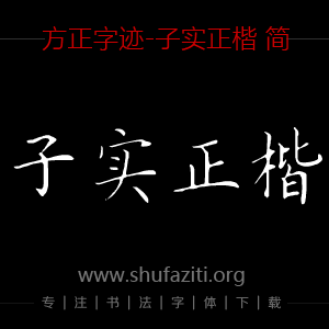
书法字体下载地址
特别提示
1、本站所有资源仅供学习与参考,请勿用于商业用途,否则产生的一切后果由您自己承担!
2、如有侵犯您的版权,请及时联系,请来信978767986#qq.com(请将#换成@发送邮件),我们将尽快处理。