


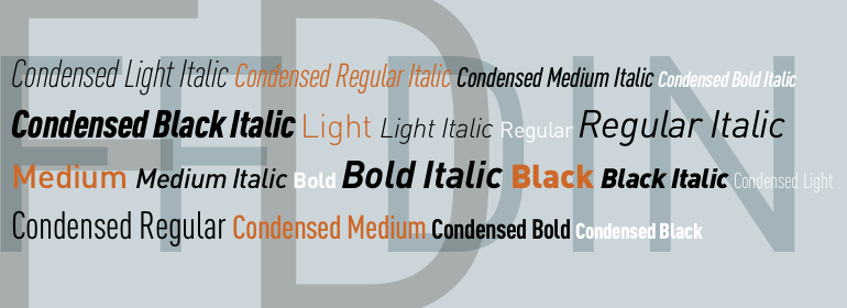
FF DIN®
方正字体说明
FF DIN®.TTF
字体英文名称:zhuan_DINPro-Thin.TTF
FF DIN®
品牌:FontFont(Monotype)
设计师:
Pool,Albert-Jan
发行时间:2018
字库编码:
Unicode
分类:
无衬线体
字体属性:
字体介绍
1994, San Francisco: Albert-Jan Pool and Erik Spiekermann took a cab together from the ATypI conference to the airport. Having known that Pool s employer had just gone bust, Spiekermann told him that if he wanted to earn some money with type design, he should have looked at fonts such as OCR and DIN. He invited Pool to Berlin to discuss the idea in detail. One year later, FontFont published Pool s FF OCR-F typeface, followed by FF DIN. Spiekermann was keenly aware of an empty space in the market. Digital DIN fonts were available at the time, but only in two weights of purely geometric shapes. Pool then designed a family of five weights. He added true italics and some alternative characters, such as the i with a round dot and lowercase figures. Later, five weights of FF DIN Condensed were added, as well as Greek and Cyrillic versions. The shape of the new FF DIN differs from the original mostly by thinner horizontal strokes and more fluent curves. Despite its primitive, technical look and clear reference to the German motorway signboards, FF DIN has become a phenomenon. The typeface has pervaded corporate and publication typography, and found its place in posters of cultural institutions. In 2011, the Museum of Modern Art in New York added the first digital typefaces to its permanent collection. Presumably due in part to the immense popularity enjoyed by FF DIN since its release in the mid-1990s, it was one of 23 designs to be included. FF DIN debuted at MoMA as part of the Standard Deviations installation in the contemporary design gallery. In 2014, German type designer Yanone was commissioned by FontFont to extend the popular FF DIN into the Arabic alphabet. Yanone had previously designed the corporate typeface for Jordan s capital Amman which was published as FF Amman in Latin and Arabic, and had secretly hoped that he could one day design FF DIN s Arabic counterpart. Coincidentally, he chose a similar approach to the development of the original DIN in the early 1900s, which started out as a hand-written master drawing and later resulted as standard DIN 1451. Yanone engineered FF DIN Arabic, published in 2015, by basing the letter shapes and proportions on a simplified hand-written Naskh skeleton on a grid. Step by step he boiled down the shapes into the digital master drawings that feature the same clarity and legibility of the Latin DIN. In 2015, two new weights Thin and Extra Light (with Italics) for both FF DIN (Normal) and FF DIN Condensed were added to the family. New Greek extensions were also introduced.
书法字体下载地址
特别提示
1、本站所有资源仅供学习与参考,请勿用于商业用途,否则产生的一切后果由您自己承担!
2、如有侵犯您的版权,请及时联系,请来信978767986#qq.com(请将#换成@发送邮件),我们将尽快处理。