


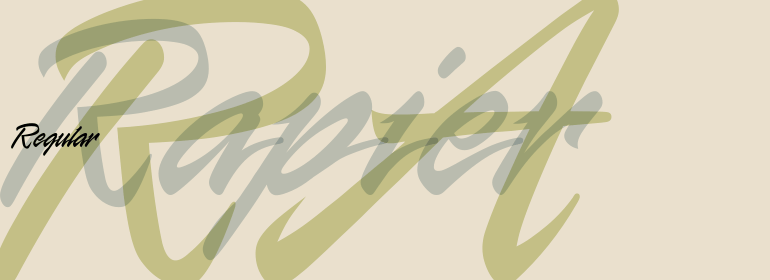


Anasdair™
方正字体说明
Anasdair™.TTF
字体英文名称:zhuan_AnasdairLTStd-Bold.TTF
Anasdair™
品牌:Linotype(Monotype)
设计师:
Yeend,Richard
发行时间:2020
字库编码:
Unicode
分类:
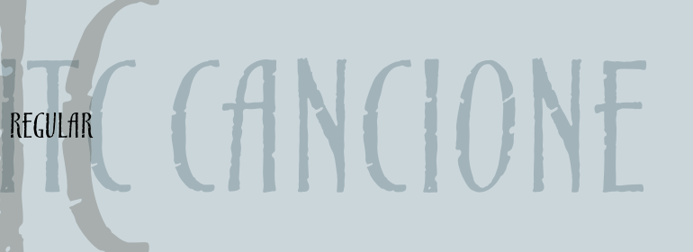
衬线体
字体属性:
字体介绍
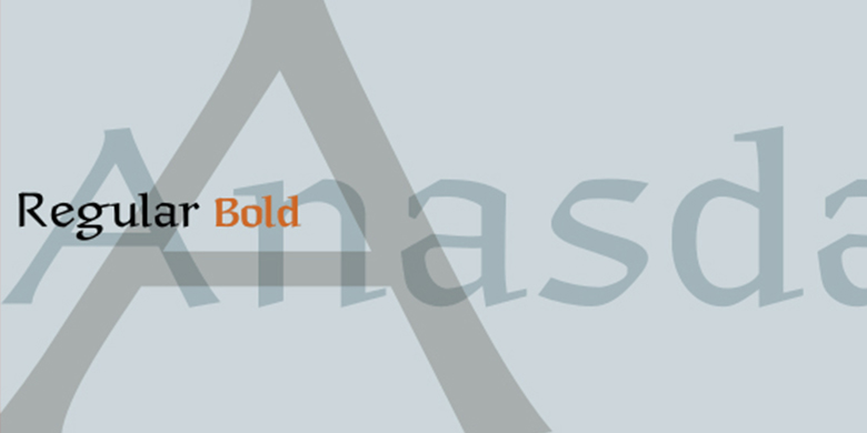
Anasdair是一种半衬线字体,保留了它的书法起源。它宽大的大写字母显示出均匀的等距外观。小写字母的设计将这种节奏与大孔径和高x高度相结合。Anasdair的笔形细节即使在很小的尺寸下也能可以识别,它们有助于引导读者的视线穿过字母的曲线,让读者的眼睛越过页面。Anasdair常规字体和Anasdair粗体都有可选的辅助替代字体。这些替代字体包含标准字符集中找不到的额外连字(例如ffi,ft和tt),以及替代字符, 例如第二个大写字母I和长s.<br><br>
Anasdair是由英国设计师Richard Yeend创建,类似于Herbert Post教授的Post Antiqua和Renate Weise的Scriptuale家族。<br><br>
Anasdair在正式应用中看起来很棒,在证书或邀请上可能特别有用。
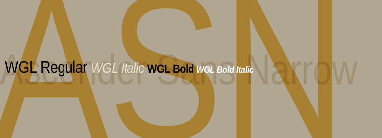
Anasdair家族的所有四种字体,包括其两个粗细和它们的替代字体,都是Linotype Libarary的Take Type 5集合的一部分。”<br><br>
Anasdair is a semi-serif text face that maintains its calligraphic origins. Its wide uppercase characters display an even, mono-spaced appearance. The design of the lowercase letters couples this rhythm with large apertures and tall x-heights. Anasdair's sharp, pen-formed details are recognizable even in small point sizes, and they help lead the eye through the letters' curves-bringing the reader's eye across the line of the page. Both Anasdair Regular and Anasdair Bold have supplementary Alternate fonts available. These Alternate fonts contain extra ligature pairs not found in the standard character set (e.g., ffi, ft, and tt), as well as alternative characters, such as a second capital I, and a long s.
Anasdair was created by the British designer Richard Yeend, and is similar to Prof. Herbert Post's Post Antiqua, and Renate Weise's extensive Scriptuale family. Anasdair looks great in formal applications, and may be particularly useful on certificates or invitations. <br>
All four fonts in the Anasdair family, including its two weights, and their alternate sets, are part of the Linotype Libarary's Take Type 5 collection."
书法字体下载地址
特别提示
1、本站所有资源仅供学习与参考,请勿用于商业用途,否则产生的一切后果由您自己承担!
2、如有侵犯您的版权,请及时联系,请来信978767986#qq.com(请将#换成@发送邮件),我们将尽快处理。