
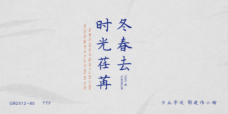

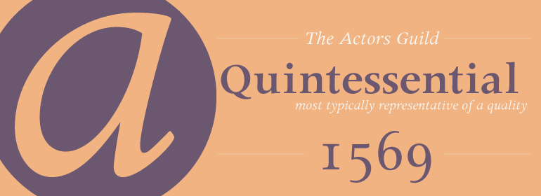

Mosquito™
方正字体说明
Mosquito™.TTF
字体英文名称:AM121___.TTF
Mosquito™
品牌:Monotype
设计师:
Berranger,Éric de
发行时间:2018
字库编码:
Unicode
分类:
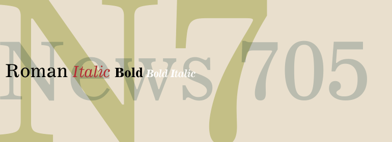
无衬线体
字体属性:
字体介绍
Éricde Berranger喜欢同时处理多个任务,经常同时设计两个字体家族。Mosquito就是这种情况,这是他在创作更为传统的Maxime时开发的一款活泼的sans。 “Mosquito代表了一种娱乐”,de Berranger说:“当我厌倦了从事一种设计时,我可以从事另一种设计,然后再满怀勇气和渴望地回到第一种设计上!” <br><br>
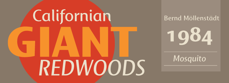
Mosquito由简单、直观的形状组成,但其独特的笔画末端和略微倾斜的应力使设计与更传统的无衬线字体区别开来。相对较大的x高度和开放的字怀增加了设计的易读性。大写字母很简单(只有一点Peignot的影子),而小写字母则更柔和、更吸引人。“我画Mosquito是希望它看起来吸引人且阅读起来很愉悦,”de Berranger说:“我最终希望它是娇柔的。”
Mosquito有三种字重,包括补充的斜体设计和一套小型大写字母、老式数字以及替代字符。”<br><br>
Éric de Berranger likes to multitask, and often works on two typeface families at once. Such was the case with Mosquito, a jaunty sans that was developed at the same time he was creating the more traditional Maxime. Mosquito represented a sort of recreation," says de Berranger. "When I grew tired of working on one design I could work on the other and then come back to the first, full of courage and desire!"<br><br>
Mosquito is built from simple, straightforward shapes, but its distinctive stroke terminals and slight oblique weight stress distinguish the design from more conventional sans serif faces. The relatively large x-height and open counters add to the legibility of the design. The capitals are straightforward (with just a hint of Peignot), while the lowercase has a softer, more inviting demeanor. "I drew Mosquito with the hope that it would be pleasant to look at and to read," says de Berranger. "I think the end result is almost feminine."<br><br>
Mosquito comes in three weights, with complementary italic designs and a suite of small caps, old style figures and alternate characters."
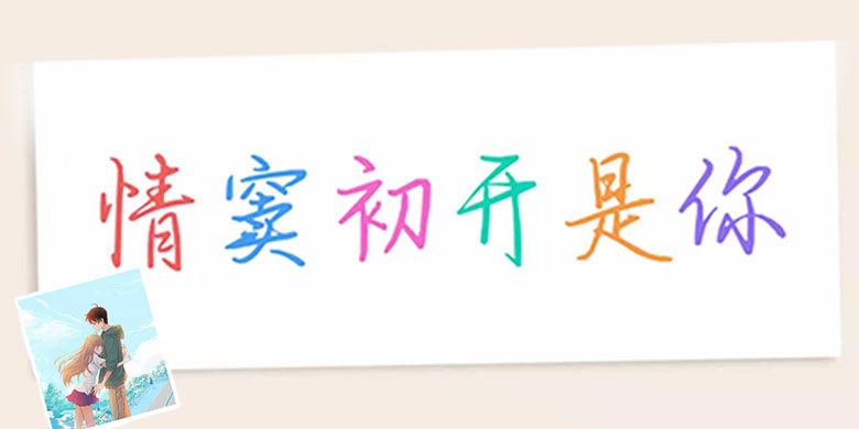
书法字体下载地址
特别提示
1、本站所有资源仅供学习与参考,请勿用于商业用途,否则产生的一切后果由您自己承担!
2、如有侵犯您的版权,请及时联系,请来信978767986#qq.com(请将#换成@发送邮件),我们将尽快处理。