


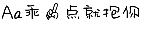


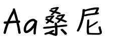

ITC Stone® Humanist
方正字体说明
ITC Stone® Humanist.TTF
字体英文名称:TC013___.TTF
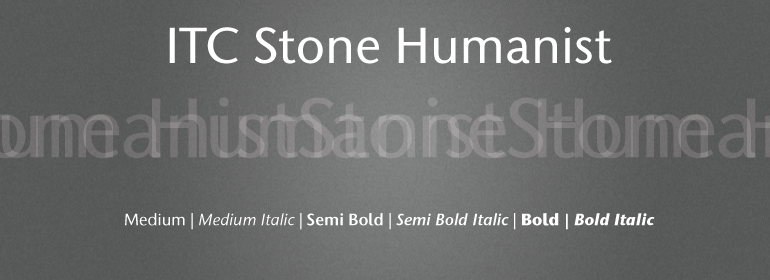
ITC Stone® Humanist
品牌:ITC(Monotype)
设计师:
Stone,Sumner
发行时间:2018
字库编码:
Unicode
分类:
无衬线体、正文字体
字体属性:
字体介绍
自20世纪20年代以来,字体设计师就一直在将无衬线设计与衬线形式集成在一起。早期的例子是Edward Johnston为London Underground的设计,以及Eric Gill的Gill Sans。其次是Jan van Krimpen的Romulus Sans,Frederic Goudy的ITC Goudy Sans,Hermann Zapf的Optima,Hans Meier的Syntax和Adrian Frutiger的Frutiger。<br><br>
现在,ITC Stone Humanist加入了这一传统。它是传统无衬线字体形状和经典衬线字母形式的巧妙结合。<br><br>
ITC Stone Humanist通过对ITC Stone Sans的Medium字重进行了一项实验,ITC Stone Sans的设计已经表明了与这些sans serif-serif混合物的关系。ITC Stone Sans的比例基于ITC Stone Serif的比例,其粗细的笔画对比显示出了人文无衬线字体的血统。但是,ITC Stone Sans的其他方面与哥特式和怪诞风格更加紧密地结合在一起,这一传统在无衬线设计中占了最大的比例。<br><br>
进入ITC Stone Humanist。Sumner Stone回忆说,在他对早期设计的实验中,我实际上对表面上的细微变化是如何改变字体的而感到相当惊讶,将设计牢牢地融入了人文主义传统。“ ‘g’、‘l’、‘M’、‘W’的形式,以及更加精致的‘a’、‘e’都是该字体家族调整的一部分,”他解释说。垂直的小写字母笔画的顶部末端被斜裁出一定的角度,上伸部和下伸部也一样。 <br><br>
ITC Stone Humanist是ITC Stone家族的正式成员,它具有相同的字重补充、x高度、比例,以及基本字符形状与三个原始设计完全兼容。<br><br>
原始的ITC字体是一种很受欢迎的字体,部分是因为其显著的多功能性。ITC Stone Humanist也有这个优点,可以成功地用于非常小的尺寸、很长的文本段落,甚至是作为广告牌大小的显示字体。”<br><br>
Type designers have been integrating the design of sans serifs with serifed forms since the 1920s. Early examples are Edward Johnston's design for the London Underground, and Eric Gill's Gill Sans. These were followed by Jan van Krimpen's Romulus Sans, Frederic Goudy's ITC Goudy Sans, Hermann Zapf's Optima, Hans Meier's Syntax and Adrian Frutiger's Frutiger.
<br><br>
Now, ITC Stone Humanist joins this tradition. It is a careful blend of traditional sans serif shapes and classical serifed letterforms.<br><br>
ITC Stone Humanist grew out an experiment with the medium weight of ITC Stone Sans, a design that already showed a relationship to these sans serif-serif hybrids. ITC Stone Sans has proportions based on those of ITC Stone Serif, and its thick-and-thin stroke contrast suggests the bloodline of humanistic sans serif typefaces. But other aspects of ITC Stone Sans are more closely aligned to the gothics and grotesques, a tradition that accounts for the largest portion of sans serif designs.<br><br>
Enter ITC Stone Humanist. During his experiments with the earlier design, Sumner Stone recalls, I was actually quite surprised at how seemingly subtle changes transformed the face," moving the design firmly into the humanist tradition. "The form of the 'g,' 'l,' 'M,' 'W,' and more subtly the 'a' and 'e' are part of the restructuring of the family," he explains. The top endings of vertical lower case strokes have been cropped on an angle, as have the ascender and descender stroke endings.
<br><br>
ITC Stone Humanist is a full-fledged member of the ITC Stone family. It has been produced with the same complement of weights, and the x-heights, proportions, and underlying character shapes are completely compatible with the three original designs.
<br><br>
The original ITC Stone Sans is a popular typeface, in part because of its notable versatility. ITC Stone Humanist shares this virtue, and can be used successfully at very small sizes, in long passages of text copy, and even as billboard-sized display type."
书法字体下载地址
特别提示
1、本站所有资源仅供学习与参考,请勿用于商业用途,否则产生的一切后果由您自己承担!
2、如有侵犯您的版权,请及时联系,请来信978767986#qq.com(请将#换成@发送邮件),我们将尽快处理。