


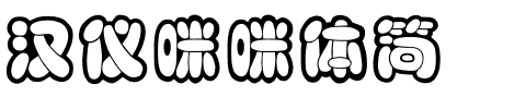


Generis® Simple
方正字体说明
Generis® Simple.TTF
字体英文名称:GenerisSimplePro-Thin.TTF
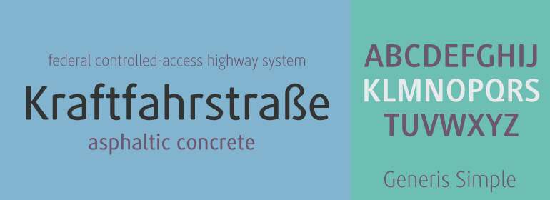
Generis® Simple
品牌:Linotype(Monotype)
设计师:
Faulhaber,Erik
发行时间:2018
字库编码:
Unicode
分类:
字体属性:
字体介绍
Erik Faulhaber在美国旅行时产生了要创作Generis字体系统的想法。在一个商业区看到各种字体混合在一起,激发他创作了一种具有相关形式的新字体系统。第一个设计方案是在1997年提出的,其遵循的是American Gothics节约空间的模式。然后,Faulhaber在最终制定该字体系统背后的计划之前,研究了可读性和各种通信媒体的需求。Generis的设计包括两种单独的设计样式;每个都可以使用或不使用衬线,从而为字体系统提供了四个独立的家族。每个都至少包含四个基本字重:Light、Regular、Medium和Bold。如有需要,还会向每个家族中添加更多的字重、小型大写字母、老式风格数字以及真正的斜体。<br><br>
Generis字体系统旨在满足视觉(optical)标准以及尽可能高的技术精度。协调性、韵律感、易读以及形式上的约束构成了前景。Generis结合了美学、技术和经济方面的优势,有目的且有效地满足了企业沟通的所有需求。基本形式的统一以及风格的独特性形成了Generis系统化的、整体包装的概念。Generis字体系统清晰正式的语言驻留在信息之下,为高级的企业标识系统(包括打印和屏幕)适当的体现了排印表达。字形细窄高耸的特性使其可以有效地设置正文,并可以经济地使用页面。一家族带重音的字符允许使用48种基于拉丁语的语言设置文本,从而提供最大的自由排印范围。这种之前并不为人所知的技术和设计执行水平有助于在企业沟通的所有领域中创建更高质量的排印。 <br><br>
字体系统中的最佳组合:Generis Serif或Generis Slab与Generis Sans或Generis Simple。<br><br>
The idea for the Generis type system came to Erik Faulhaber while he was traveling in the USA. Seeing typefaces mixed together in a business district motivated him to create a new type system with interrelated forms. The first design scheme came about in 1997, following the space saving model of these American Gothics. Faulhaber then examined the demands of legibility and various communications media before finally developing the plan behind this type system. Generis's design includes two individually designed styles; each of with is available with and without serifs, giving the type system four separate families. Each includes at least four basic weights: Light, Regular, Medium, and Bold. Further weights, small caps, old style figures, and true italics were added to each family where needed.<br><br>
The Generis type system is designed to meet both optical criteria and the highest possible measure of technical precision. Harmony, rhythm, legibility, and formal restraint make up the foreground. Generis combines aesthetic, technical, and economic advantages, which purposefully and efficiently cover the whole range of corporate communication needs. The unified basic form and the individual peculiarity of the styles lead to Generis' systematic, total-package concept. The clear formal language of the Generis type system resides beneath the information, bringing appropriate typographic expression to high-level corporate identity systems, both in print and on screen. The condensed and aspiring nature of the letterforms allows for the efficient setting of body copy, and the economic use of the page. A range of accented characters allows text to be set in 48 Latin-based languages, offering maximal typographic free range. This previously unknown level of technical and design execution helps create higher quality typography in all areas of corporate communication. <br><br>
Optimal combinations within the type system: Generis Serif or Generis Slab with Generis Sans or Generis Simple.
书法字体下载地址
特别提示
1、本站所有资源仅供学习与参考,请勿用于商业用途,否则产生的一切后果由您自己承担!
2、如有侵犯您的版权,请及时联系,请来信978767986#qq.com(请将#换成@发送邮件),我们将尽快处理。