
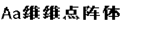


ITC Panache®
方正字体说明
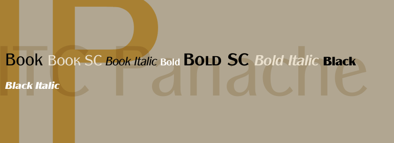
ITC Panache®.TTF
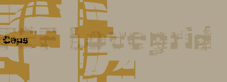
字体英文名称:ITCPanacheSC-Bold.TTF
ITC Panache®
品牌:ITC(Monotype)
设计师:
Benguiat,Edward
发行时间:2018
字库编码:
Unicode
分类:
无衬线体
字体属性:
字体介绍
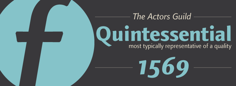
和其他大多数艺术作品一样,字体为我们提供了一个了解作者个性和情感的窗口。ITC Panache不仅提供了这个窗口,它的名字也很贴切。ITC Panache的创始人Edward Benguiat先生在设计中富有活力和创造力,Ed Benguiat设计了数百种令人兴奋和流行的字体。<br><br>
Benguiat的设计目标是创建一种多功能、实用和独特的无衬线字体。我们认为他的成功令人钦佩。ITC Panache的三种字重搭配得非常好,可以互相补充,或者在必要时提供强调。在文本大小和设计微调的广泛测试中产生了一个字体家族,该家族非常均匀且颜色一致。在ITC Panache中设置的文本很吸引人。它非常容易阅读,即使在长文本块或小字号上。<br><br>
当设置在更大的尺寸或用于标题时,ITC Panache的性格特征对读者来说变得更加明显。它们有助于创建具有特色和风格的图形。大或小。一点或很多。很难不使用ITC的Panache。<br><br>
如果你将ITC Panache归类,它可能会被归类为无衬线体,但这并不能完全描述该设计,也不能完全符合该设计。笔画粗细有轻微的对比,随着字重的增加,该差异变得更加明显。但ITC Panache与其他无衬线体还有很多区别,也许最明显的是它的高腰和相应的“圆形”,这两个特征使ITC Panache与感性联系在一起。相反,在Cloister和ITC Berkeley Old Style等字体设计中典型的老式 "e",以及在20世纪初无衬线字体设计中常见的"g"。大写字母“A”甚至有Caslon设计的杯型上衣。ITC Panache的美丽之处在于,所有这些看似毫不相关的设计特点,都融合在了一个非凡的连续性设计中。”<br><br>
Typefaces, like most other works of art, provide a small window into the personalities and sensibilities of the artists who create them. ITC Panache not only provides this window, it is also aptly named. Mr. Edward Benguiat the dreator of ITC Panache, has all the dash, verve (and panache) hinted at in the design, Creative, capable and prolific, Ed Benguiat has drawn hundreds of exciting and popular typeface designs.
<br><br>
Benguiat's design goal was to create a sans serif typestyle that is versatile, utilitarian - and distinctive. We think he has succeeded admirably. ITC Panache's three weights mix exceptionally well to complement each other or provide emphasis where necessary. Extensive testing at text sizes and design fine-tuning has produced a typeface family which is remarkably homogenous and consistent in color. Text set in ITC Panache is inviting without dissapointment. It is exceptionally easy to read, even in long text blocks of copy or small point sizes.
<br><br>
When set in larger sizes or used for headlines, ITC Panache's character traits becomes more apparent and pronounced to the reader. They help to create graphics with distinction and style. Big or small. a little or a lot. it's hard not to use ITC Panache well.
<br><br>
If you could pigeonhole ITC Panache, it would probably be classified as a stressed sans", but this would not completely describe, or do justiceto, the design. There is a slight contrast in stroke weight, which becomes more pronounced as the familiy weight increases; but there is a more to distinguish ITC Panache from ather sans serifs. Perhaps most obvious is its high waist and correspondingly slight condensation of the top half of the "round" capitals. Both of these traits link ITC Panache with the sensuous forms of art nouveau creations. In contrast are the typicall old style "e" found in designs like Cloister and ITC Berkeley Old Style, and the two storied "g" common to the early 20th century sans serif designs. The capital "A" even has the cupped top found in Caslon designs. Part of the beauty of ITC Panache is that all of these seemingly unrelated desig traits are melded into a design of exceptional continuity."
书法字体下载地址
特别提示
1、本站所有资源仅供学习与参考,请勿用于商业用途,否则产生的一切后果由您自己承担!
2、如有侵犯您的版权,请及时联系,请来信978767986#qq.com(请将#换成@发送邮件),我们将尽快处理。