


Ondine™
方正字体说明
Ondine™.TTF
字体英文名称:OndineCom.TTF
Ondine™
品牌:Linotype(Monotype)
设计师:
Frutiger,Adrian
发行时间:2018
字库编码:
Unicode
分类:
书法体
字体属性:
字体介绍
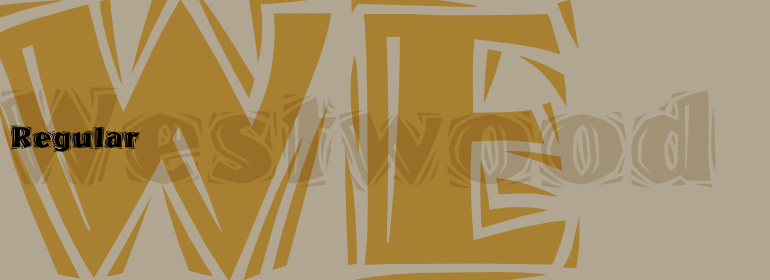
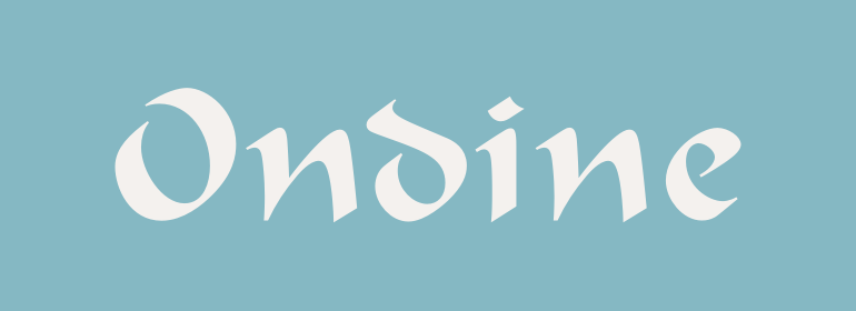
1952年,Charles Peignot做出了一个大胆而幸运的举动:他邀请了一位年轻的瑞士设计师到巴黎担任Deberny&Peignot字体铸造厂的艺术总监。这开始了Adrian Frutiger的专业字体设计生涯;从那时起,他设计了各种惊人的大师级别的字体。他最早的作品之一是1954年的Ondine™,这款手写体让人联想起中世纪的哥特式草书。Frutiger非常了解历史上有名的字母形式。作为一名学生,他创作了一家族获奖的木刻作品,展示了西方字母的发展。作为Ondine设计过程的一部分,Frutiger实际上是使用剪刀从一张黑色的纸上剪出的形状,这种技术需要艺术家的想象力和技巧才能发挥其明显的简约性。 Ondine是北欧神话中的海上女神。如同她的名字一样,Ondine字体的主笔画略显膨胀,尖锐的末端、圆形字母未封闭的字碗,而且给人一种轻微向左倾斜的错觉。这种字体有时候被用来制造一种阿拉伯的异国情调,但Ondine可以很好地用于任何显示排版。尝试在书记标题、广告,或者标牌种使用12pt或更大的磅值。”<br><br>
In 1952, Charles Peignot made a bold and fortuitous move: he invited a young Swiss designer to Paris to be the art director of the Deberny & Peignot type foundry. This started the professional type design career of Adrian Frutiger; and since then he has designed an astonishing range of masterful typefaces. One of his earliest was Ondine™ in 1954, a script face reminiscent of gothic cursive writing from the middle ages. Frutiger understood historic letterforms well; as a student he'd made a series of prize-winning woodcuts showing the development of the western alphabet. As part of the design process for Ondine, Frutiger actually used scissors to cut the forms out of a piece of black paper, a technique that requires the vision and skill of an artist to exploit its apparent simplicity. Ondine was a sea nymph from Nordic mythology. Like her namesake, Ondine the typeface has gently swelling main strokes, sharp terminals, un-closed bowls in round letters, and the illusion of a very slight backslant. This font is sometimes used to give an air of Arabian exoticism, but Ondine works well for any display typography usage. Try it in point sizes of 12 and larger for book titles, advertising, or signage."
书法字体下载地址
特别提示
1、本站所有资源仅供学习与参考,请勿用于商业用途,否则产生的一切后果由您自己承担!
2、如有侵犯您的版权,请及时联系,请来信978767986#qq.com(请将#换成@发送邮件),我们将尽快处理。