

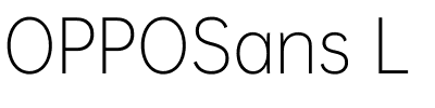


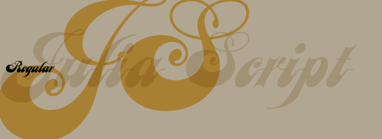

Linotype Punkt™
方正字体说明
Linotype Punkt™.TTF
字体英文名称:LT_54813.TTF
Linotype Punkt™
品牌:Linotype(Monotype)
设计师:
Leiner,Mischa
发行时间:2018
字库编码:
Unicode
分类:
字体属性:
字体介绍
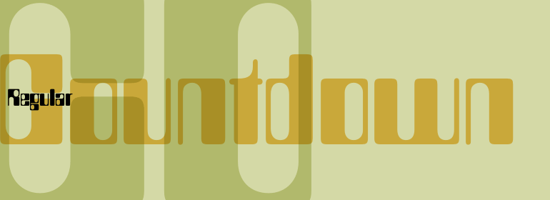
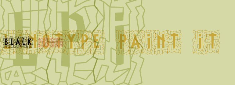
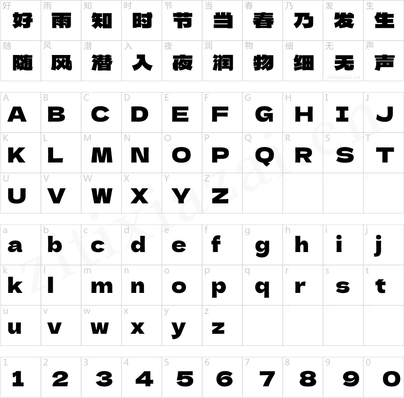
Linotype Punkt字体由美国设计师Mischa Leiner设计,它是Take Type字体库的一部分,是从1999年Linotype举办的International Digital Type Design Contest的参赛作品中选出的,已被列入TakeType 3 CD。该字体有三种字重可供选择:细体,常规体和粗体。它是一款无衬线字体,而图形是由均匀排列的圆点组成的,因此得名Punkt(德语是圆点的意思)。这种与众不同的特征使该字体看起来好像是在灯光的背景下。此字体的另一个独特之处是其三个字重的性质。每种字重的图形都具有完全相同的尺寸,相同的宽度、广度等。唯一可变的是组成形状的每个点,这使粗体字重比细体要黑得多,同时外部轮廓又保持不变。Linotype Punkt应该用于较大的磅值,因为如果磅值太小,点会模糊在一起,使字体失去“光”。因此,该字体最适用于大及非常大磅值的标题。 <BR><BR>
Linotype Punkt, from US designer Mischa Leiner, is part of the TakeType Library, chosen from the entries of the Linotype-sponsored International Digital Type Design Contest 1999 for inclusion on the TakeType 3 CD. This font, from US designer Mischa Leiner is available in three weights, light, regular and bold. The basic forms are those of a robust sans serif, however the figures are composed of evenly placed dots, hence the name Punkt, the German word for dot. This distinguishing characteristic lets this font look as though it appears on a background of light. One other unique trait of this font is the nature of the three weights. The figures of each weight have exactly the same measurements, the same width, breadth, etc. The only variable measurements are those of the individual dots making up the forms, making the bold weight much darker than the light while retaining the same outer contours. Linotype Punkt should be used in larger point sizes, as when it is too small the dots blur together and rob the font of its 'light'. The font is therefore best for headlines in large and very large point sizes.
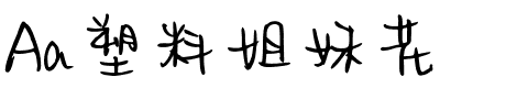
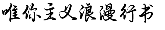
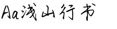
书法字体下载地址
特别提示
1、本站所有资源仅供学习与参考,请勿用于商业用途,否则产生的一切后果由您自己承担!
2、如有侵犯您的版权,请及时联系,请来信978767986#qq.com(请将#换成@发送邮件),我们将尽快处理。