


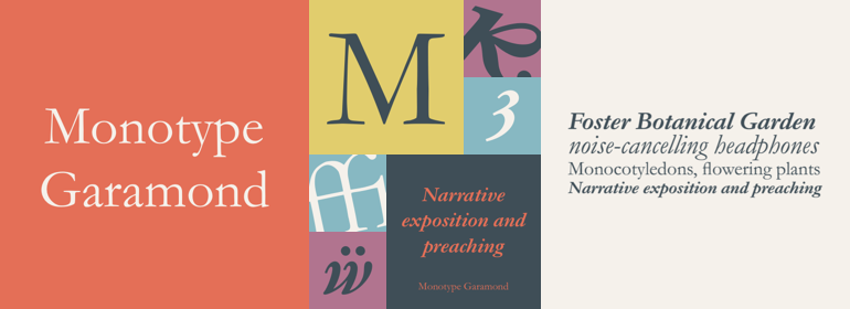
Monotype Garamond
方正字体说明
Monotype Garamond.TTF
字体英文名称:GARA.TTF
Monotype Garamond
品牌:Monotype
设计师:
Monotype Design Studio
发行时间:2018
字库编码:
Unicode
分类:
衬线体
字体属性:
字体介绍
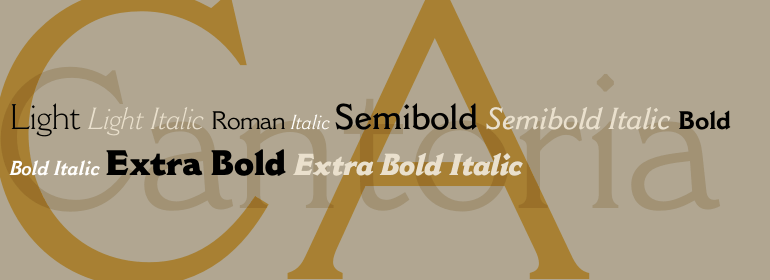
Monotype Garamond是一个非常精致的设计,并且无疑是Garamond字体风格最优雅的诠释之一。Monotype Garamond在笔画字重、开放的字怀和精致的衬线上形成了鲜明的对比,它非常清晰易读,几乎可以设置为任何尺寸。Roman和Bold字重之间的对比非常完美。<br><br>
当然,这种示例性的字体复兴是对卓越模型的致敬。事实证明,这种模型是受Claude Garamond启发而设计的,而并非由他而设计。<br><br>
二十世纪三十年,在Stanley Morison的领导下,Monotype进行了欧洲当时最激进的字体开发计划,之前从未有过。该程序包括原始字体和对旧设计的解释。它最终会产生诸如Centaur、Gill Sans、Perpetua和Ehrhardt这样的字体,以及Monotype的Bembo、Baskerville、Fournier版本,当然还有Monotype Garamond的版本。<br><br>
Monotype Garamond字体切割于1922年,是Morison著名的字体复兴的第一个版本。它是仿照French Imprimerie Nationale的字体而制作的,French Imprimerie Nationale是法国政府印刷百年历史的办公室(大致相当于US Government Printing Office或英国Her Majesty's Stationery Office)。<br><br>
长期以来,人们一直认为Imprimerie字体是Claude Garamond在16世纪早期的作品。直到1926年,Monotype和许多其他铸造厂的Garamond“字体发布后,字体历史学家Beatrice Warde才发现这种字体是法国Sedan的Jean Jannon的作品。Jannon是后来的一位设计师,他的作品比Garamond字体晚了大约80年。(为了扭转对这个错误的信息,沃Warde以“Paul Beaujon”的笔名发表了她的这一发现)。<br><br>
就像Monotype后来的三个Century一样,Jannon的目标是模仿伟大的罗马字体大师的风格并将他们的设计提供给当时那个时代的印刷商。显然他成功了,法国Imprimerie购买了他的字体,随着时间的推移,Jean Jannon的名字逐渐被淡忘,人们开始相信这些字体确实是出自早期的雕刻大师之手。<br><br>
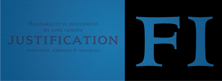
在Monotype Garamond中,就像对该字体的其他说明一样,字符笔画粗细应力是倾斜的,最明显的部分大约在两点和八点钟方向。头部衬线(字符笔画的顶部)看起来像小横幅,基线衬线往往较长而略呈杯状,末端柔和圆滑。<br><br>
Monatype Garamond字体家族包括两个Roman字重以及它的补充斜体设计。这个家庭还提供小型大写字母、老式数字以及一家族斜体替代字符。虽然主要用于文本合成,但Monotype Garamond是独特的、活泼的,并在大尺寸下非常通用。”<br><br>
Monotype Garamond is a design of remarkable sophistication, and is certainly one of the most elegant interpretations of the Garamond type style. With its distinct contrast in stroke weights, open counters and delicate serifs, Monotype Garamond is exceptionally legible and can be set at virtually any size. The contrast between the Roman and Bold weights is nothing short of ideal.<br><br>
Such an exemplary type revival is, of course, a tribute to the excellence of the model. As it turns out, the model in this case was inspired - but not designed - by Claude Garamond.<br><br>
It was under Stanley Morison's leadership, in the third decade of the twentieth century, that Monotype undertook the most aggressive program of typeface development ever attempted in Europe up to that time. The program encompassed original typefaces and interpretations of old designs. It would ultimately produce such faces as Centaur, Gill Sans, Perpetua, and Ehrhardt, as well as Monotype's versions of Bembo, Baskerville, Fournier and of course, Monotype Garamond.
<br><br>
Cut in 1922, Monotype Garamond was the first of Morison's celebrated typeface revivals. It was patterned after type from the archives of the French Imprimerie Nationale, the centuries-old office of French government printing (broadly equivalent to the US Government Printing Office, or Her Majesty's Stationery Office in the UK).<br><br>
The Imprimerie type was long believed to be the early-16th-century work of Claude Garamond. It was only in 1926, after Garamond" fonts from Monotype and many other foundries had been released, that type historian Beatrice Warde discovered the type was the work of Jean Jannon, of Sedan, France. Jannon was a later designer who produced his work some eighty years after the fonts of Garamond. (In an added twist to this mistaken-identity plot, Warde published her discovery under the pseudonym "Paul Beaujon.")<br><br>
Jannon's goal, much like Monotype's three centuries later, was to imitate the style of the great masters of roman type and make their designs available to printers of his own day. Obviously, he succeeded. The French Imprimerie purchased his types and, over time, as the name of Jean Jannon faded, came to believe they were indeed fonts from the earlier master punch cutter.
<br><br>
In Monotype Garamond, as with other interpretations of the face, character stroke-weight stress is canted, with the heaviest parts at approximately the two and eight o'clock positions. Head serifs (those at the top of character strokes) look like little banners, and baseline serifs tend to be long and slightly cupped, with soft, rounded terminals.
书法字体下载地址
特别提示
1、本站所有资源仅供学习与参考,请勿用于商业用途,否则产生的一切后果由您自己承担!
2、如有侵犯您的版权,请及时联系,请来信978767986#qq.com(请将#换成@发送邮件),我们将尽快处理。