

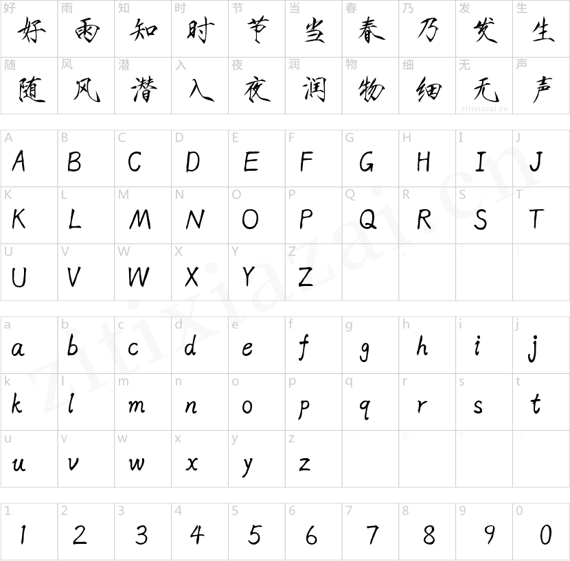
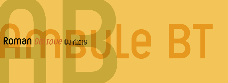
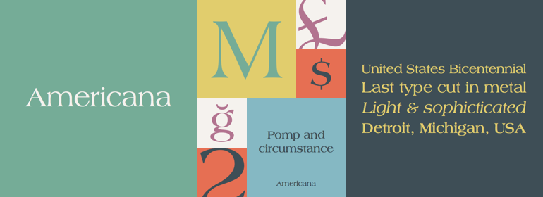


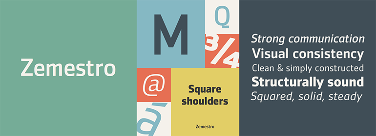
Zemestro™
方正字体说明
Zemestro™.TTF
字体英文名称:AM210___.TTF
Zemestro™
品牌:Monotype
设计师:
Farey,Dave
发行时间:2018
字库编码:
Unicode
分类:
无衬线体、正文字体
字体属性:
字体介绍
Zemestro是一种易于阅读的简单设计。根据其设计师Dave Farey的说法,它没有任何书法特征,也没有定义或可识别的单个字符——它只是线条流畅,结构简单。” <br><br>
Farey的目标是创作一种比那些仅有单一字符及笔画宽度的字体更加清晰、更加友好的字体。该字体是基于Farey的两个较早的设计:Cachet——他在1999年绘制的soft-terminal无衬线体,以及为英国科学杂志《New Scientist》创作的部分字母。Cachet看起来像是等距的且是由精确的几何笔画构成,但事实并非如此。为《New Scientist》绘制的字符比Cachet更为细窄且结构化。后来的Zemestro采用了《New Scientific》都得字母比列,并将它们构建成一个完整的字体家族。圆形字符的字肩是正方形的,这有助于在视觉上创建一致的字母间距甚至排印色彩。<br><br>
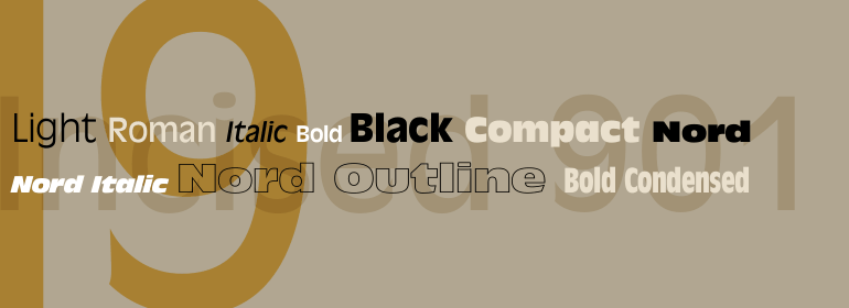
Zemestro家族有四种字重,两种最细的字重还有补充的斜体。 文本以Book字重显示时看起来很吸引人且轻松悦目,而Regular则更具气势和权威性。Medium和Bold字重非常适合于在文本正文中进行强调,以及在显示尺寸时也是很强的传播者。<br><br>
关于Zemestro这个名字? “我一直对字体名称很着迷,”Farey说。“我的大多数灵感来自电影或书籍。”在阅读一本关于俄国革命的书时,Farey了解到zemestro这个词指的是一个村委会或长者组织,“在列宁同志将其全部解散之前,”他解释道。“所以这是自1917年以来的第一个Zemestro。我认为这值得复兴。”<br><br>
Zemestro is a straightforward design that is meant to be read. According to its designer, Dave Farey, There's nothing calligraphic about it, and there are no defining or identifiable single characters -- it's just clean and simply constructed."
<br><br>
Farey's goal was to create a more legible and friendlier typeface than those limited to single character and stroke widths. The face finds its foundation in two earlier designs from Farey: Cachet, a soft-terminal sans he drew in 1999, and a partial alphabet he created for the New Scientist, a British scientific journal. Cachet appears to be monospaced and constructed with geometrically precise character strokes, but it isn't. The characters drawn for New Scientific are more condensed and structured than Cachet. Their offspring Zemestro takes on the proportions of the New Scientific letters and builds them into a full typeface family. Round characters have squared shoulders, helping to create visually consistent letter spacing and even typographic color. Terminals are now square and clipped at right angles to the stroke.
<br><br>
The Zemestro family is available in four weights, with complementary italics for the two lightest weights. Text copy in the Book weight is inviting and easy on the eyes, while the Regular is more imposing and authoritative. The Medium and Bold weights are excellent for providing emphasis in text copy and are also strong communicators at display sizes.
<br><br>
The name Zemestro? "I'm always fascinated by typeface names," says Farey. "Most of mine are inspired by movies or books." It was while reading a book on the Russian revolution that Farey learned zemestro was the word for a village council or group of elders, "before Comrade Lenin dissolved them all," he explains. "So this is the first Zemestro since 1917. I thought it was worth reviving.""
书法字体下载地址
特别提示
1、本站所有资源仅供学习与参考,请勿用于商业用途,否则产生的一切后果由您自己承担!
2、如有侵犯您的版权,请及时联系,请来信978767986#qq.com(请将#换成@发送邮件),我们将尽快处理。