
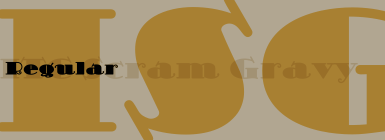


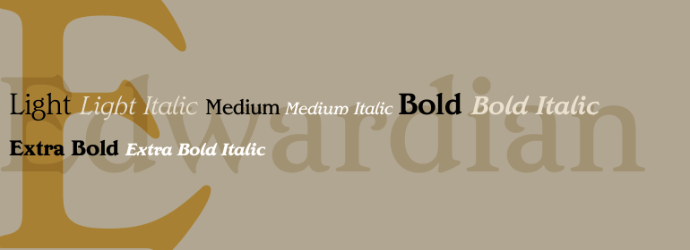


Optima nova®
方正字体说明
Optima nova®.TTF
字体英文名称:LT_55476.TTF
Optima nova®
品牌:Linotype(Monotype)
设计师:
Zapf,Hermann; Kobayashi,Akira
发行时间:2018
字库编码:
Unicode
分类:
无衬线体
字体属性:
字体介绍
Optima™由Hermann Zapf设计,是他最成功的字体。1950年,在参观佛罗伦萨的圣十字教堂时,Zapf作了他的第一个草图。他从大约1530年被切割的墓碑板上绘出字母,由于当时他身边没有其他的纸,这些草图是在两张1000里拉的钞票上完成的。这些来自教堂地板上的字母激发了创作Optima的灵感,这是一种按比例和字符排列的古典罗马字体,但没有衬线。字体是按照黄金比例设计的。1952年,经过仔细的易读性测试,第一批图纸完成。<br><br>
这款字体是由法兰克福D. Stempel AG公司著名的冲床切割师Augustug Rosenberger设计的。Optima于1958年发布。凭借其无衬线字体的清晰,简单的优雅以及其温暖的人情味,该家族已在世界范围内广受欢迎。2002年,终于有可能生产出不受技术限制和折衷的数字字母,并且在首次绘制草图后的50多年后,完成了Optima家族的扩展和重新设计,并发布了Optima nova。<br><br>
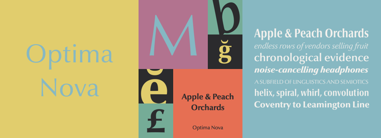
Hermann Zapf和日本字体设计师小林章(Akira Kobayashi)合作完成了这个项目,包括对现有字重的重新设计以及为40种字体添加了几个新字重。增加了小型大写字母、老式数字、Light、 Heavy、和Condensed字重。<br><br>
原来的 Optima从来没有制造一个真正的斜体,只有一个斜版的罗马字重。Optima™ nova拥有一家族设计精美的真实斜体; 新的斜体形式,e,f和g的新斜体形式尤其值得注意。<br><br>
标题字形包括大写字母与特殊和不寻常的字母组合和连字,使它成为标题,标志和广告的一个很好的选择。Optima仍然是一种通用字体; Optima nova适用于从书籍文本到标牌的任何东西。”<br><br>
Optima™ was designed by Hermann Zapf and is his most successful typeface. In 1950, Zapf made his first scetches while visiting the Santa Croce church in Florence. He sketched letters from grave plates that had been cut about 1530, and as he had no other paper with him at the time, the sketches were done on two 1000 lire bank notes. These letters from the floor of the church inspired Optima, a typeface that is classically roman in proportion and character, but without serifs. The letterforms were designed in the proportions of the Golden Ratio. In 1952, after careful legibility testing, the first drawings were finished.
<br><br>
The type was cut by the famous punchcutter August Rosenberger at the D. Stempel AG typefoundry in Frankfurt. Optima was produced in matrices for the Linotype typesetting machines and released in 1958. With the clear, simple elegance of its sans serif forms and the warmly human touches of its tapering stems, this family has proved popular around the world. In 2002, when it was finally possible to produce digital alphabets without technical limitations and compromises, and more than 50 years after the first sketches, an expansion and redesign of the Optima family was completed and released as Optima nova.
<br><br>
Hermann Zapf and Japanese type designer Akira Kobayashi collaborated on the project, which included re-working of the existing weights and the addition of several new weights for a total of 40 fonts. Small caps, Old style Figures, light, heavy, and condensed fonts have been added.
<br><br>
The original Optima was never manufactured with a real italic, only an oblique version of the roman. Optima™ nova has a complete range of beautifully designed real italics; the new italic forms , of the e, f and g are especially notable.
<br><br>
The titling face includes capital letters with special and unusual letter combinations and ligatures, making it an excellent choice for headlines, logos and advertising purposes. Optima continues to be an all-purpose typeface; and Optima nova works for just about anything from book text to signage."
书法字体下载地址
特别提示
1、本站所有资源仅供学习与参考,请勿用于商业用途,否则产生的一切后果由您自己承担!
2、如有侵犯您的版权,请及时联系,请来信978767986#qq.com(请将#换成@发送邮件),我们将尽快处理。