


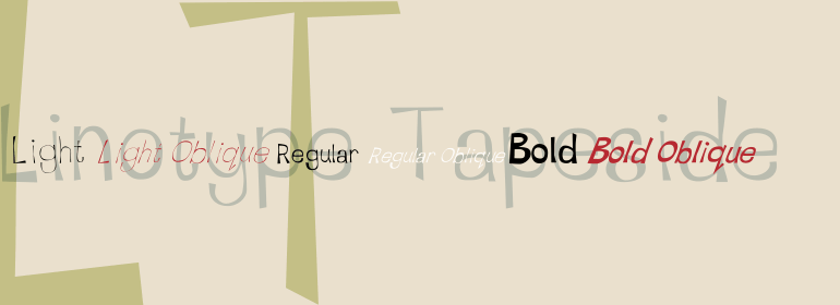


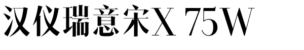
ITC Magnifico™
方正字体说明
ITC Magnifico™.TTF
字体英文名称:MAGNDI__.TTF

ITC Magnifico™
品牌:ITC(Monotype)
设计师:
Kobayashi,Akira
发行时间:2018
字库编码:
Unicode
分类:
字体属性:
字体介绍
ITC Magnifico Daytime和ITC Magnifico Nighttime受到19世纪装饰风格字体和刻字的启发。“尽管它们被设计成显示字体,但它们的使用并不局限于大标题。“通常,三维字体会被用在大海报的大标题上,但我觉得如果这种装饰性字体用在小尺寸上,比如12点,也会很有趣,”设计师小林章(Akira Kobayashi)说。“在19世纪印刷的卡片中有一些小型的三维字体的例子。我仔细研究了他们的字形,并对那些小的三维字体越来越感兴趣。ITC Magnifico的轮廓非常坚固,可以用于小尺寸。有时,“阴影”的角度或形状不得不稍作修改,甚至是不合逻辑的,因为字形应看起来尽可能简单。生成的字体在小尺寸显示时很容易阅读,我希望在大尺寸显示时,那些偶尔出现的奇怪现象会显得很迷人。”<br><br>
ITC Magnifico Daytime and ITC Magnifico Nighttime are inspired by nineteenth-century decorated types and letterings. “Although they are designed as display typefaces, their use is not limited to large headings. Usually three-dimensional types are employed in gigantic headings in large posters, but I thought it would be interesting if such decorative types were used as well in small sizes, say at 12 point,” says designer Akira Kobayashi. “There were a few examples of small three-dimensional types used in cards printed in the nineteenth-century. I studied their letterforms carefully and became more and more interested in those small three-dimensional types. The outlines of ITC Magnifico are robust enough to endure use at small sizes. Sometimes the angle or the shape of the 'shadow' had to be slightly modified or even illogical, because the letterforms ought to look as simple as possible. The resulting types are fairly easy to read at small sizes, and I hope that at large sizes those occasional oddities will appear charming.”
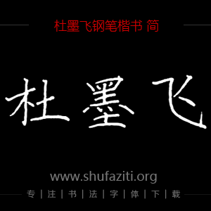
书法字体下载地址
特别提示
1、本站所有资源仅供学习与参考,请勿用于商业用途,否则产生的一切后果由您自己承担!
2、如有侵犯您的版权,请及时联系,请来信978767986#qq.com(请将#换成@发送邮件),我们将尽快处理。