


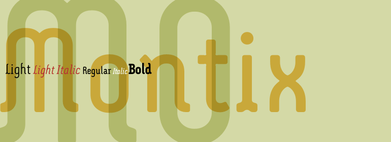


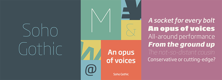


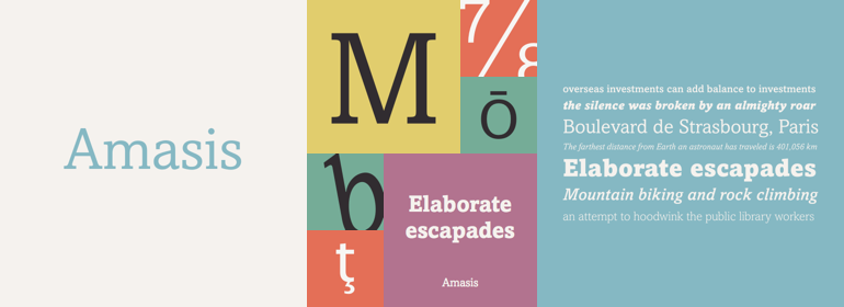


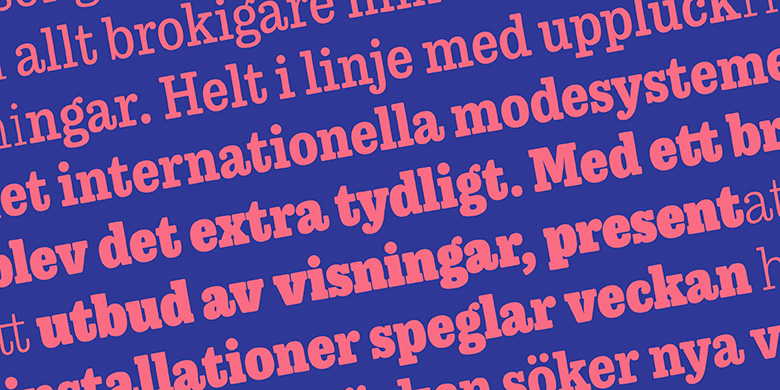


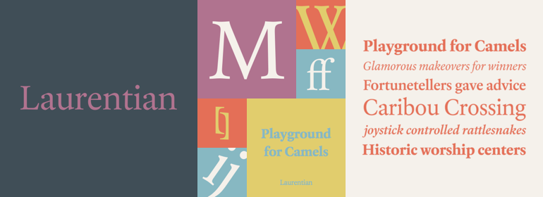
Laurentian™
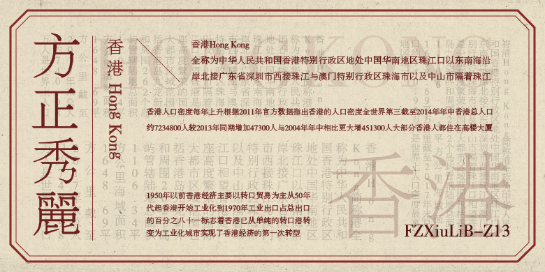
方正字体说明
Laurentian™.TTF
字体英文名称:AM248___.TTF
Laurentian™
品牌:Monotype
设计师:
McDonald,Rod
发行时间:2018
字库编码:
Unicode
分类:
衬线体
字体属性:
字体介绍
Maclean’s是加拿大一家新闻杂志周刊。它涉及到从地球另一端的暴力事件到当地出产最大南瓜的一切新闻。<br><br>
2001年,Maclean邀请Rod McDonald加入设计团队,对“96岁的出版物”进行更新。该杂志旨在为读者提供一种专业的、简洁且易于阅读的印刷风格,最重要的是,字体必须能够讲述每一期涉及的数百个不相关的主题,同时保持可信度且毫不造作。<br><br>
这也许是个艰巨的任务吧?现在补充一下,这将是有史以来第一个由加拿大杂志委托制作的文本字体,McDonald,曾被认为是加拿大非官方的“typographer laureate”接受了这一挑战。<br><br>
McDonald使用了两个历史模型作为Laurentian设计的基础:法国字体设计师Claude Garamond的作品,以及英国的印刷商兼字体设计师William Caslon的作品。从Garamond Laurentian那里学习了人文主义的轴心,清晰的衬线以及模仿钢笔笔画的末端。Caslon的字母缺少人文气息,笔画粗细和衬线的对比更加明显,看起来更像是结构化的而非绘制的。这些特点也在Laurentian这里留下了印记。<br><br>
以这两种设计为基础,McDonald以狭窄的文字栏和杂志创作使用的小号字体为出发点绘制了Laurentian。他为自己的字母设计了粗壮的垂直笔画和坚固的衬线,高大的x高度以及略微压缩的字符宽度。<br><br>
从这款字体的易读性、安静有活力以及字母的开放性可以明显看出McDonald的天赋。结果就产生了这样一种字体:既满足Maclean’s需求,而且还为其他各种应用提供了卓越的服务。<br><br>
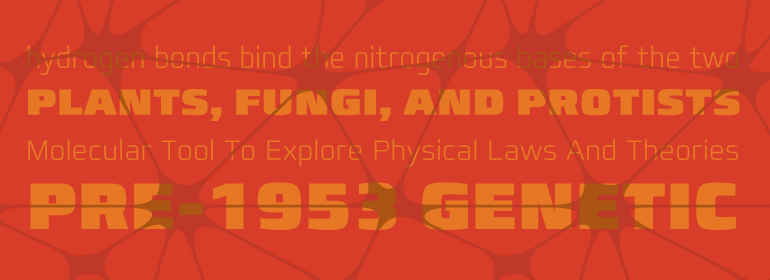
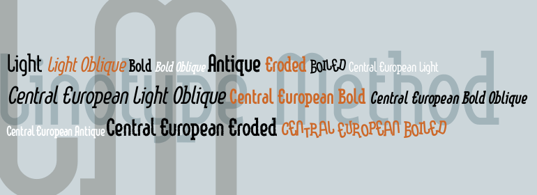
Laurentian有三种字重:Regular、Semi Bold和Bold, Regular和Semi Bold的补充斜体,以及一组标题大写字母。”<br><br>
Maclean's is a weekly Canadian newsmagazine with a broad editorial mission. A typical issue covers everything from violence on the other side of the globe to the largest pumpkin grown in a local county.<br><br>
In 2001, Maclean's invited Rod McDonald to become part of the design team to renovate" the 96-year-old publication. The magazine wanted to offer its readers a typographic voice that was professional, clean, and easy to read. Above all, the typeface had to be able to speak about the hundreds of unrelated subjects addressed in each issue while remaining believable and uncontrived.
<br><br>
A tall order, perhaps? Now add in that this would be the first text typeface ever commissioned by a Canadian magazine. McDonald, who some have called Canada's unofficial "typographer laureate," took on the challenge.<br><br>
McDonald used two historic models as the basis for Laurentian's design: the work of French type designer Claude Garamond, and that of the English printer and type founder, William Caslon. From Garamond Laurentian acquired its humanist axis, crisp serifs and terminals that mimic pen strokes. Caslon's letters are less humanistic, with a more marked contrast in stroke weight and serifs that appear constructed rather than drawn. These traits also made their mark on Laurentian.
<br><br>
Using these two designs as a foundation, McDonald drew Laurentian with the narrow text columns and small type sizes of magazine composition in mind. He gave his letters strong vertical strokes and sturdy serifs, a robust x-height and a slightly compressed character width
<br><br>
A tall order, per McDonald's genius is evident in the face's legibility, quiet liveliness and in the openness of the letters. The result is a typeface that not only met Maclean's demanding design brief, but also provides exceptional service in a wide variety of other applications.
<br><br>
Laurentian is available in three weights of Regular, Semi Bold and Bold, with complementary italics for the Regular and Semi Bold, and a suite of titling caps."
书法字体下载地址
特别提示
1、本站所有资源仅供学习与参考,请勿用于商业用途,否则产生的一切后果由您自己承担!
2、如有侵犯您的版权,请及时联系,请来信978767986#qq.com(请将#换成@发送邮件),我们将尽快处理。