


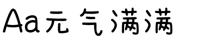


ITC Tempus® Sans
方正字体说明
ITC Tempus® Sans.TTF
字体英文名称:ITCTempusSansCom-Regular.TTF
ITC Tempus® Sans
品牌:ITC(Monotype)
设计师:
Grimshaw,Phill
发行时间:2018
字库编码:
Unicode
分类:
字体属性:
字体介绍
ITC Tempus是英国设计师Phill Grimshaw的作品。他声称每个书法家的愿望都是用钢笔画出完美的罗马大写字母,但是他承认这非常困难。对于这种字体,Grimshaw在便宜的多孔纸上使用了自来水钢笔,当然墨水会洇。由此而形成的格式很经典,但其粗糙的边缘与罗马式的完美外观有所不同。而且,Tempus Sans只是去掉衬线的Tempus,但字符的比例仍然很好。” Grimshaw说。由于其粗糙的特征,字体在较大尺寸显示时效果最佳,但即使在较小的尺寸下也能保持其字符清晰。”<br><br>
ITC Tempus is the work of British designer Phill Grimshaw. He claims that every calligrapher's aspiration is to draw perfect roman capitals with a pen, but admits that this is extremely difficult. For this typeface, Grimshaw used a fountain pen on cheap, porous paper and, of course, the ink bled. The resulting forms are classic but their rugged edges deviate from the perfection of roman type. And Tempus Sans is just Tempus with the serif surgically removed, yet the proportions of the characters work nicely," says Grimshaw. Because of its rough quality, the typeface works best in larger point sizes, yet maintains its characters even in smaller sizes."
书法字体下载地址
特别提示
1、本站所有资源仅供学习与参考,请勿用于商业用途,否则产生的一切后果由您自己承担!
2、如有侵犯您的版权,请及时联系,请来信978767986#qq.com(请将#换成@发送邮件),我们将尽快处理。