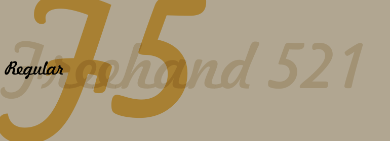


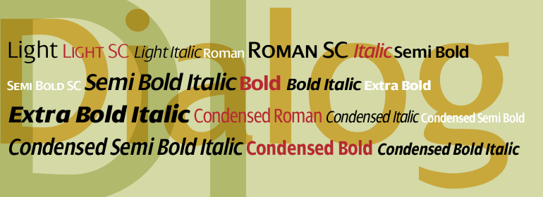


Caslon™ Antique
方正字体说明
Caslon™ Antique.TTF
字体英文名称:LT_55840.TTF
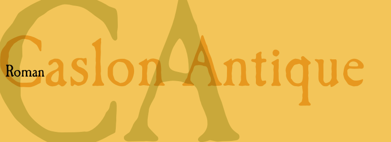
Caslon™ Antique
品牌:Linotype(Monotype)
设计师:
Nadall,Berne
发行时间:2018
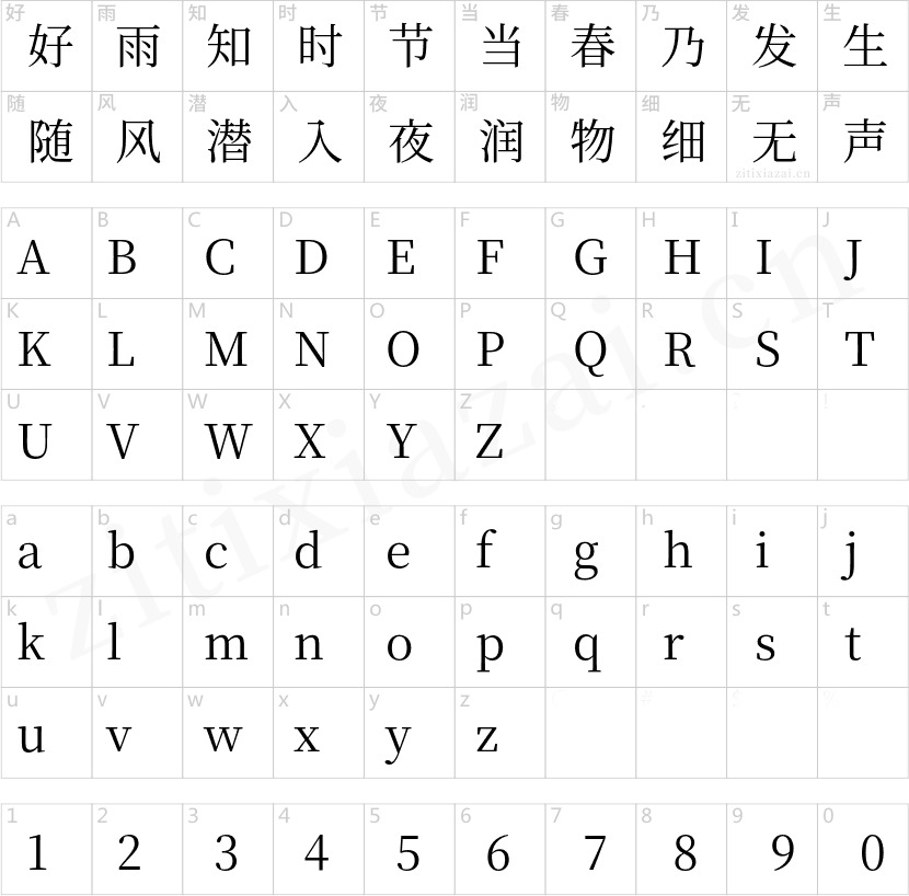
字库编码:
Unicode
分类:
衬线体
字体属性:
字体介绍
从1720年到1766年去世,英国人William Caslon冲击了许多罗马、斜体及非拉丁字体。当时大多数字体都是从荷兰进口到英国的,因此Caslon受到荷兰字体特征的影响。然而,他确实有一定的工艺水平,使他成为第一位伟大的英国雕刻师。<br>
Caslon罗马体变得如此受欢迎,它被称为手写体之王,在大洋的另一边,美国人在1776年的《独立宣言》中使用了它。<br>
Caslon的字体在印刷商与字体界中享有传奇地位,被认为是安全、牢靠和妥当的。<br>
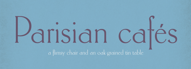
Caslon Antique由Berne Nadall设计,于1896年至1898年由美国字型厂商Barnhart Bros&Spindler推出。它与Caslon没有任何相似之处,但具有人们想像中的十八世纪字体的那种古朴粗糙的风格。在平面设计中使用Caslon Antique来实现那种怀旧的效果。大尺寸显示的标题或大写字母缩写看起来效果最好。<br>
Caslon Black是于20世纪90年代由David Farey设计的,由一个相对细窄且非常粗的字重组成。它专门用于标题。 Caslon Black在其形状的阴影中隐藏着一丝原创Caslon的痕迹,但却有它自己强烈的表达方式。<br>
Caslon Graphique由Leslie Usherwood于20世纪80年代设计。风格基本接近原创Caslon,但是这个版本字形宽厚,超细的细笔划与很粗的主笔划之间具有强烈的对比。这款精确绘制且风格化的Caslon有一种魄力; 它非常适合大尺寸显示的标题或大写字母缩写。<br>
The Englishman William Caslon punchcut many roman, italic, and non-Latin typefaces from 1720 until his death in 1766. At that time most types were being imported to England from Dutch sources, so Caslon was influenced by the characteristics of Dutch types. He did, however, achieve a level of craft that enabled his recognition as the first great English punchcutter. Caslon's roman became so popular that it was known as the script of kings, although on the other side of the political spectrum (and the ocean), the Americans used it for their Declaration of Independence in 1776. The original Caslon specimen sheets and punches have long provided a fertile source for the range of types bearing his name. Identifying characteristics of most Caslons include a cap A with a scooped-out apex; a cap C with two full serifs; and in the italic, a swashed lowercase v and w. Caslon's types have achieved legendary status among printers and typographers, and are considered safe, solid, and dependable.
<br>
Caslon Antique was designed by Berne Nadall and brought out by the American type foundry Barnhart Bros & Spindler in 1896 to 1898. It doesn't bear any resemblance to Caslon, but has the quaint crudeness of what people imagine type looked like in the eighteenth century. Use Caslon Antique for that old-timey" effect in graphic designs. It looks best in large sizes for titles or initials.
<br>
Caslon Black was designed by David Farey in the 1990s, and consists of one relatively narrow and very black weight. It is intended exclusively for titles or headlines. Caslon Black has a hint of the original Caslon lurking in the shadows of its shapes, but has taken on its own robust expression.
<br>
Caslon Graphique was designed by Leslie Usherwood in the 1980s. The basic forms are close to the original Caslon, but this version has wide heavy forms with very high contrast between the hairline thin strokes and the fat main strokes. This precisely drawn and stylized Caslon has verve; it's ideal for headlines or initials in large sizes."
书法字体下载地址
特别提示
1、本站所有资源仅供学习与参考,请勿用于商业用途,否则产生的一切后果由您自己承担!
2、如有侵犯您的版权,请及时联系,请来信978767986#qq.com(请将#换成@发送邮件),我们将尽快处理。