


Stratos
方正字体说明
Stratos.TTF
字体英文名称:stratos-thin.TTF
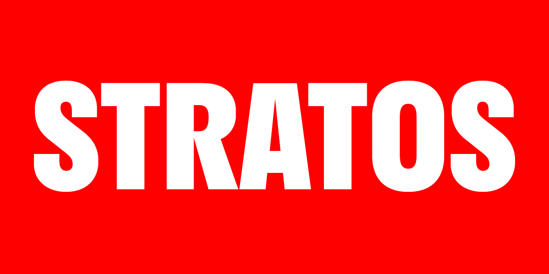
Stratos
品牌:Production Type
设计师:
Yoann Minet
发行时间:2018
字库编码:
Unicode
分类:
无衬线体
字体属性:
心动字
字体介绍
Stratos is a geometric grotesque whose peculiar utility is derived from unusual ideas about proportion. It eschews conventional notions of typographic relationships — not just for novel effect, but to empower the user to do more interesting things with type.
The first and most obvious of these surprises can be seen in the difference between its upper- and lowercase. The caps are condensed, inspired by gothic wood type of the 20th century, while the minuscules are akin to certain classic geometric sans serifs, with circular rounds (o, d, b, p, q) and horizontal terminals (a, c, e, g, s). This contradiction presents intriguing possibilities. Used separately, the two designs exude individual personalities: the compact caps fill a page with the impact of a Victorian-era poster; the lowercase conveys an austere modernity. When employed together, the look is unexpected but surprisingly functional, thanks to carefully balanced spacing and weight.
The other uncommon concept has to do with the widths between weights. In Stratos, a line set in Black occupies no more space than one set in Thin. Each of the family’s ten weights share a common width — a technique known as multiplexing. This is useful for experimenting with font choice in magazine layouts, where content can remain constant while weight is adjusted. It also presents interesting opportunities for expressive and responsive typography. A website with dynamic backgrounds, for example, can serve the appropriate weight for optimal legibility without effecting the width of the text or the wrapping of lines. The upper- and lowercase letters are multiplexed as well, offering even more design flexibility.
书法字体下载地址
特别提示
1、本站所有资源仅供学习与参考,请勿用于商业用途,否则产生的一切后果由您自己承担!
2、如有侵犯您的版权,请及时联系,请来信978767986#qq.com(请将#换成@发送邮件),我们将尽快处理。