


Walbaum LT
方正字体说明
Walbaum LT.TTF
字体英文名称:WalbaumPro-Roman.TTF
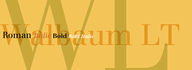
Walbaum LT
品牌:Linotype(Monotype)
设计师:
Walbaum,Justus Erich
发行时间:2018
字库编码:
Unicode
分类:
字体属性:
字体介绍
Walbaum最初是由Justus Erich Walbaum于1800年前后在Weimar制作的。它与Bodoni和Didot一起被评为欧洲最伟大的“现代”风格字体。现代风格字体标志着18世纪末和19世纪初排印发展到了鼎盛。它们的特征与之前的字体截然不同:如极端的垂直应力和精细的细线与大胆的主笔划形成鲜明对比。
这款当代版本的Walbaum字体与J. E. Walbaum的原创版本非常接近,它与其他现代字体的不同之处在于它有更宽的大写字母和更大的x字高。
个别字符也与其他现代字符完全不同,例如b没有字脚衬线,小写字母a的字怀近似方形,而大写字母Q的小尾巴具有奇怪的非对称接合点。
这款出色的字体家族清晰易读,灵活多变,在开放性和优雅性方面给人不可抗拒的温暖。这可能是现代字体风格中最独特的一款。
<br>
Walbaum was originally punchcut by Justus Erich Walbaum in Weimar around 1800. It ranks with Bodoni and Didot as one of the great European "modern" style typefaces. Modern types represented the ultimate typographic development of the late eighteenth and early nineteenth centuries. They have characteristics quite different from the types that preceded them; such as extreme vertical stress and fine hairlines contrasted by bold main strokes. This contemporary version of the Walbaum font is quite authentically close to J. E. Walbaum's original, and it distinguishes itself from the other moderns with its wider caps and larger x-height. Some of the individual characters are quite different from other moderns as well, such as the b with no foot serif, the lowercase a with its squarish counter shape, and the Q tail with the curious asymmetric juncture. Possibly the most unique of the modern types, this beautiful family is legible, flexible, and has compelling warmth in its openness and grace."
书法字体下载地址
特别提示
1、本站所有资源仅供学习与参考,请勿用于商业用途,否则产生的一切后果由您自己承担!
2、如有侵犯您的版权,请及时联系,请来信978767986#qq.com(请将#换成@发送邮件),我们将尽快处理。