


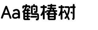


Quitador™
方正字体说明
Quitador™.TTF
字体英文名称:QuitadorPro-Regular.TTF
Quitador™
品牌:Linotype(Monotype)
设计师:
Freytag,Arne
发行时间:2018
字库编码:
Unicode
分类:
字体属性:
字体介绍
A Modern Slab Serif: Quitador from Arne Freytag
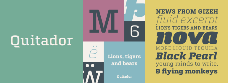
Arne Freytag's Quitador is a modern slab serif that mirrors the zeitgeist. The robust and very well-equipped font appears trustworthy, reliable and confident, and can be used in the most diverse range of applications.
It is no accident that the letter "Q" is the first letter in the name of the font, Quitador. Freytag designed the upper-case "Q" as the first letter of the new font and derived the other characters from it.
With few exceptions, Quitador was designed as a monolinear font, so that only a few letters have careful variations in the weights. Moreover, the shape of the superellipse plays a central role and lends the letters a somewhat technical, designed character. Numerous and in some cases lively details interrupt this formal appearance. The starts of several curves are offset slightly and have semicircular ends. In this way, Freytag not only creates more white space, but also gives the letters "a" very unique and particular character. For example, "h", "m" or "n" recall stencil lettering, while "b" or "q" appear as if they were constructed from a single line. With another interesting detail, the serifs added to only one side of the foot on the "h", "m" or "n", for example, Freytag hints at the line ends of a script font and brings warmth to Quitador. Round dots also emphasize this friendly flair.
A large x-height not only creates space in the letters for extra-bold styles, but also lends Quitador an open and generous character in the more narrow and semi-bold versions. The legibility of the font also benefits from this design trait in the smaller font sizes.
Along with the upright styles, Quitador has a true italic. The lightly tilted letters have round, extended line ends, which lends them a soft and dynamic character while allowing them to maintain their shape extensively. Only the lower-case "a" changes to the closed variant; the "f" gets a descender and the "e" is designed so as to be more round.
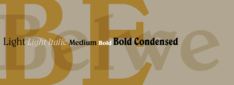
With seven weights, Quitador covers an enormous bandwidth, from Ultra Light to Ultra Bold, and as a result is suited to the most diverse applications. In headlines, the font can set the tone, thanks to its distinctive details; in the smaller sizes, it is also easily legible. In the more narrow styles and the italic, the humanist character of Quitador is on display and lends the font a particularly friendly character.
Use Quitador for headings on posters or as a reading font in magazines, for example. Quitador also cuts a fine figure on the Web or on mobile devices.
书法字体下载地址
特别提示
1、本站所有资源仅供学习与参考,请勿用于商业用途,否则产生的一切后果由您自己承担!
2、如有侵犯您的版权,请及时联系,请来信978767986#qq.com(请将#换成@发送邮件),我们将尽快处理。