


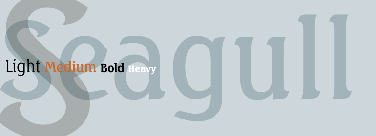


Verdana® Pro
方正字体说明
Verdana® Pro.TTF
字体英文名称:VerdanaPro-LightItalic.TTF
Verdana® Pro
品牌:Linotype(Monotype)
设计师:
Carter,Matthew,Rickner,Tom,Berlow,David,Ross,DavidJonathan
发行时间:2011
字库编码:
Unicode
分类:
无衬线体
字体属性:
字体介绍
<p>verdana 家族字体是专门为应对屏幕显示的挑战而设计的。verdana 最初是由世界著名的类型设计师马修·卡特设计的, 由 truetype 专家 tom rickner 进行了屏幕显示调整。verdana 字体是专门为计算机屏幕设计的类型的独特示例。verdana 家族字体在2011年获得了一个重大的更新, 亦即Monotype Imaging和马修·卡特之间的合作。</p>
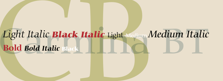
<p>最初的 verdana 家族只包含四种字体: 普通字体、斜体字体、粗体字体和粗体斜体。新的和扩展的 verdana pro 家族总共包含20种字体。verdana pro 和 verdana pro 压缩家族各包含10种字体: 浅色、普通、半粗、粗体和黑色 (每种字体都配以匹配的斜体样式)。verdana 展示的特征来自像素, 而不是笔、画笔或凿子。在直线、曲线和对角线之间的平衡进行了精心调整, 以确保小尺寸的像素图案令人愉悦、清晰且清晰。常见的混乱字符, 如小写 i j l、大写 i j l 和数字 1, 都是为了最大限度的个性而精心绘制的--这是为屏幕上使用而设计的字体的一个重要特征。在屏幕上可以识别 verdana 字体的另一个原因是它们的宽度和间距很大。</p>
<p>由大卫·伯娄和字体局的大卫·乔纳森·罗斯设计的,由马修·卡特排版咨询,新的Verdana Pro包括各种高级排版特征,包括真正的小字体、连线、分形。款式、陈旧图形、内衬表格和内衬比例图。需要使用OpenType精明的应用程序来访问这些排版特征。字体的扩展权重和全新的浓缩范围为设计者提供了一个扩展字体调色板选项,用于打印和屏幕上,在小文本大小和标题中使用。</p>
<p>The Verdana typeface family was designed specifically to address the challenges of on-screen display. Verdana was originally designed by world-renowned type designer Matthew Carter, and tuned for screen display by the leading TrueType hinting expert, Tom Rickner. The Verdana fonts are unique examples of type designed specifically for the computer screen.The Verdana family received a major update in 2011 as a collaboration between The Font Bureau, Monotype Imaging and Matthew Carter. </p><p>The original Verdana family included only four fonts: regular, italic, bold and bold italic. The new and expanded Verdana Pro family contains 20 fonts in total. The Verdana Pro and Verdana Pro Condensed families each contain 10 fonts: Light, Regular, Semibold, Bold and Black (each with matching italic styles).Verdana exhibits characteristics derived from the pixel rather than the pen, the brush or the chisel. The balance between straight, curve and diagonal were meticulously tuned to ensure that the pixel patterns at small sizes are pleasing, clear and legible. Commonly confused characters, such as the lowercase i j l, the uppercase I J L and the number 1, have been carefully drawn for maximum individuality - an important characteristic of fonts designed for on-screen use. Another reason for the legibility of the Verdana fonts on the screen is their generous width and spacing.</P><p>Designed by David Berlow and David Johnathan Ross of the Font Bureau, with typographic consultation by Matthew Carter, the new Verdana Pro includes a variety of advanced typographic features including true small capitals, ligatures, fractions, old style figures, lining tabular figures and lining proportional figures. An OpenType-savvy application is required to access these typographic features. The expanded weights and completely new condensed range of fonts provide designers with an expanded palette of typographic options for use in print and on-screen, in both small text sizes and headlines.</P>
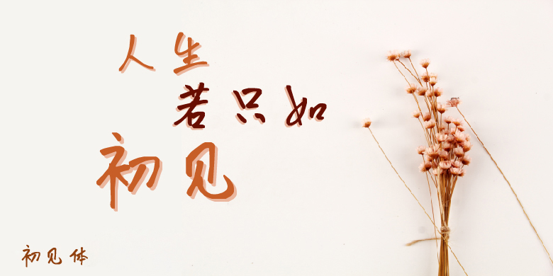
书法字体下载地址
特别提示
1、本站所有资源仅供学习与参考,请勿用于商业用途,否则产生的一切后果由您自己承担!
2、如有侵犯您的版权,请及时联系,请来信978767986#qq.com(请将#换成@发送邮件),我们将尽快处理。