


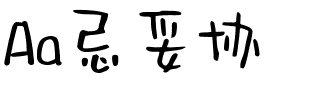


Cardinal
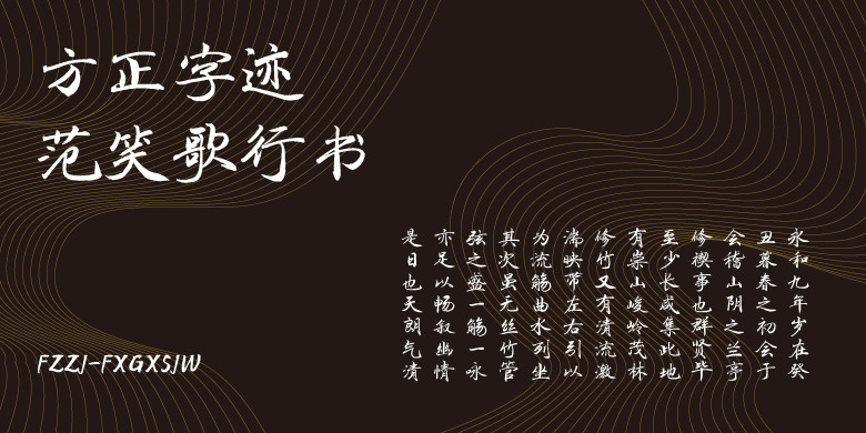
方正字体说明
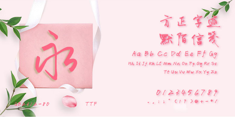
Cardinal.TTF
字体英文名称:cardinalclassiclong-regular.TTF
Cardinal
品牌:Production Type
设计师:
Jean-Baptiste Levée
发行时间:2018
字库编码:
Unicode
分类:
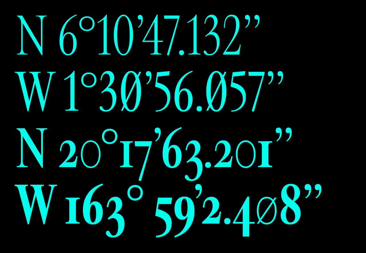
衬线体
字体属性:
心动字
字体介绍
Synthetic organisms look human, yet are made of artificial materials. Cardinal is the equivalent of the androïd characters called “synthetics”, which were developed in the movie series Alien. Synthetics entertain a close relationship with the living world and have a troubling resemblance with the models they imitate — humans. Androïds do not emit heat, smell or pheromones, and their synthetic origin is thus hard to detect. Cardinal is an exploration of that idea in type design. It navigates between the organicity of classic text typefaces and the plasticity of contemporary digital type. It has some traits of designs by Garamont and Granjon but bears its own dryness and rigidity. Reminiscent of an era of “old digital typefaces”, Cardinal evokes the early computing days. Synthetics do not die, they are just sometimes deactivated.
The Cardinal system is developed in three distinct directions. First, the core styles are Cardinal Classic Short, Mid, and Long, which have three x-heights that can be adjusted depending on body copy point size and line length. We recommend using Cardinal Classic Long for titles and subheads or brief paragraphs of text. Cardinal Classic Mid fits standard body text sizes, and Cardinal Classic Short works well at small sizes. Second, Cardinal Fruit is a very specific flavor of condensed, recalling early computer advertisements. Its Italics are particularly sharp and will convey a sense of liveliness and accuracy. Last, Cardinal Photo has much more stroke contrast, a tight-but-not-touching spacing, and a rather big x-height, making it a good companion to photographs when set at display sizes.
书法字体下载地址
特别提示
1、本站所有资源仅供学习与参考,请勿用于商业用途,否则产生的一切后果由您自己承担!
2、如有侵犯您的版权,请及时联系,请来信978767986#qq.com(请将#换成@发送邮件),我们将尽快处理。