


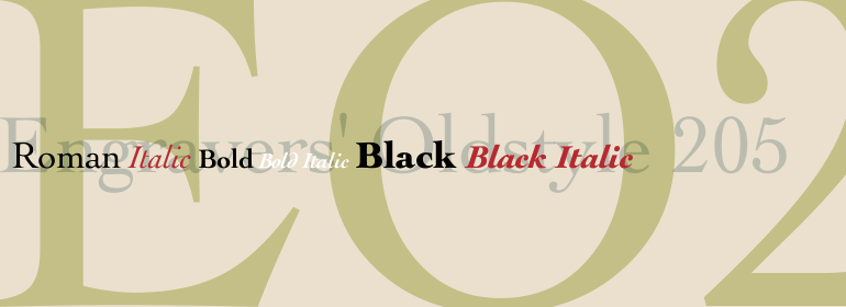


Eurostile® Next
方正字体说明
Eurostile® Next.TTF
字体英文名称:EurostileNextW1G-Regular.TTF

Eurostile® Next
品牌:Linotype(Monotype)
设计师:
Kobayashi,Akira; Linotype Design Studio; Weinzierl,Terrance
发行时间:2018
字库编码:
Unicode
分类:
字体属性:
字体介绍
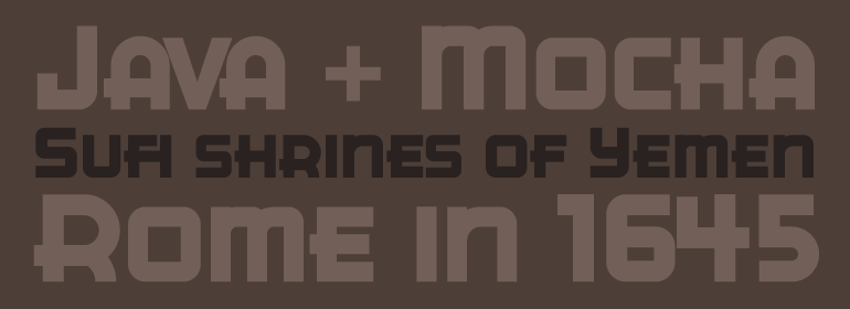
Eurostile Next是Linotype对1962年Aldo Novarese的设计进行重新绘制和扩展的版本。这个新版本可以追溯到原始的金属字体和它的中世纪现代美学的方形字符和微妙的曲线。Eurostile Next恢复了在其他数字版本中丢失的柔和曲线,因此重新获得了原始设计的精神和稍显柔和的风格。这个家族已经大大扩展,现在由五种不同的字重组成:超细、细、常规、半粗和粗体。除了常规宽度外,所有字重还具有宽体和窄体版本。在风格上,Eurostile Next非常适合20世纪五六十年代的时尚设计,但它仍然具有非常新颖的现代感。其大量的变体及排印功能对于从企业品牌到一次性海报、从大型标牌到小型印刷文本的项目都非常宝贵。
<br><br>
Eurostile Next is Linotype's redrawn and expanded version of Aldo Novarese's 1962 design. This new version refers back to the original metal types and to its mid-century modern aesthetic of squarish characters and subtle curves. Eurostile Next brings back the gentle curves, which were lost in other digital versions, therefore regaining the spirit of the original design and its somewhat softer demeanor. The family has been greatly expanded, now consisting of five different weights: ultra light, light, regular, semibold, and bold. Along with the regular width, all weights also have extended and condensed versions. Stylistically, Eurostile Next is well suited for designs in the fashion of the 50's and 60's, yet it still has a remarkably new and contemporary feeling. Its numerous variations and typographic features are invaluable for projects ranging from extensive corporate branding to one-off posters and from large signage to small print text.
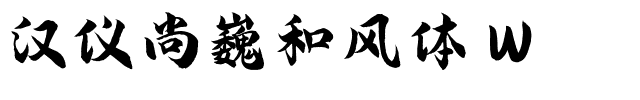
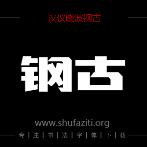
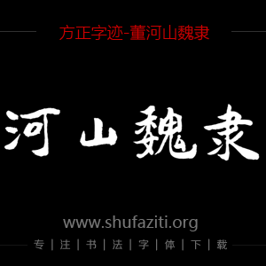
书法字体下载地址
特别提示
1、本站所有资源仅供学习与参考,请勿用于商业用途,否则产生的一切后果由您自己承担!
2、如有侵犯您的版权,请及时联系,请来信978767986#qq.com(请将#换成@发送邮件),我们将尽快处理。