


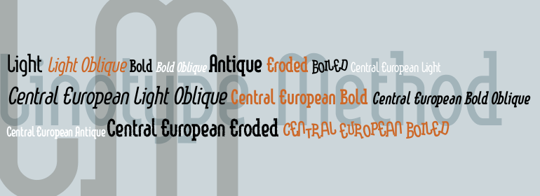
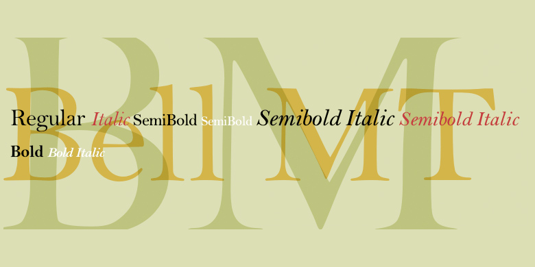


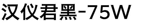


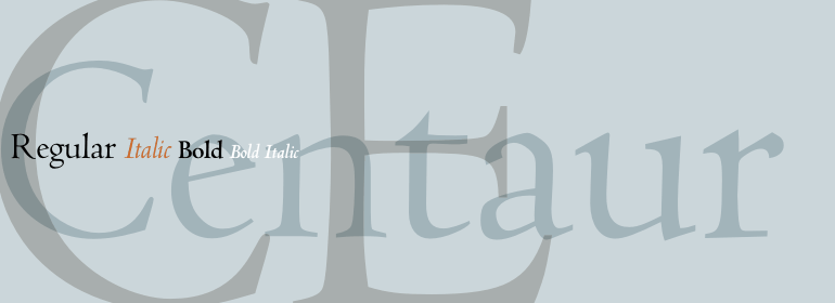
Centaur®
方正字体说明
Centaur®.TTF
字体英文名称:CentaurMTPro-Regular.TTF
Centaur®
品牌:Monotype
设计师:
Rogers,Bruce; Warde,Frederic
发行时间:2018
字库编码:
Unicode
分类:
字体属性:
字体介绍
Centaur可能是15世纪 Nicolas Jenson所切割的罗马式最著名的字体。伟大的美国印刷和书籍设计师Bruce Rogers在1914年受命为纽约大都会艺术博物馆(Metropolitan Museum of Art, New York)设计一款独特的字体。Rogers想要强调字母形状的书写质量,他放大了Jenson的字体,并用平头笔画了字母。然后,他挑选出最好的字母,用笔刷和白漆把它们润色一下,Robert Wiebking就从这些图案中剪出了新的字体。它以Rogers在1915年出版的第一本书《The Centaur》的名字命名。伦敦的 Lanston Monotype 削减了The Centaur的商业版本,并于1929年发行。Rogers说服Frederic Warde设计斜体,并给它取了自己的单独名称Arrighi。因为Jenson没有裁出斜体字,Warde使用了由Ludovico degli Arrighi在1524到1527年期间制作的样式作为他的模型。他倾斜了大写字母,缩短了上升部的长度,以便与Centaur的上升部的高度相配。小写的斜体g是一个值得注意的字符,因为它没有耳朵。当前的数字版本的Centaur字体有罗马字体和斜体字体,包括粗体、小型大写字母、替换字体和斜体。Centaur Italic和Centaur Italic (Arrighi)的区别是小写z。<br><br>
1458年,查理七世派遣法国人Nicolas Jenson到美因茨学习活字印刷术,Gutenberg就在美因茨工作。Jenson本应该带着他新学的技能回到法国,但他去了意大利,就像当时其他巡回印刷工人一样。从1468年起,他来到了威尼斯,在那里他成为了一名打孔工、印刷工和出版人。他可能是第一个使用活字印刷的非德国人,他印刷了大约150个版本。从1470年到1480年他去世的这几个世纪里,他的书一直是字体设计师的灵感来源。他的罗马字体通常被称为第一个真正的罗马字体。”值得注意的是,几乎所有的Jensonian Romans都使用小写的e,也就是众所周知的“Venetian Oldstyle e”。<br><br>
相似的字体包括Aldus™、Minister和Stempel Schneidler™。” <br><br>
Centaur is probably the best known re-creation of the roman type cut by Nicolas Jenson in the fifteenth century. The great American typographer and book designer, Bruce Rogers, was commissioned to design an exclusive type for the Metropolitan Museum of Art (New York) in 1914. Rogers, who wanted to emphasize the written quality of the letter shapes, enlarged photos of Jenson's type and drew over the letters with a flat pen. He then selected the best letters and touched them up with a brush and white paint, and the new type was cut from these patterns by Robert Wiebking. It was named Centaur after the title of the first book designed by Rogers using the type: The Centaur" by Maurice de Guérin, published in 1915. Lanston Monotype of London cut the commercial version of Centaur and released it in 1929. Rogers convinced Frederic Warde to design the italic, which was given its own separate name of Arrighi. Because Jenson did not cut a companion italic, Warde used as his models the types cut by Ludovico degli Arrighi in 1524-27. He inclined the caps and shortened the ascenders so it would go better with the height of Centaur's ascenders. The lowercase italic g is a notable character because it has no ear. The current digital version of Centaur has both roman and italic, and includes bold weights, small caps, alternates and swashes. The difference between Centaur Italic and Centaur Italic (Arrighi) is in the lowercase z. Use the Centaur family for book composition, headlines, and elegant advertising pieces.
<br><br>
In 1458, Charles VII sent the Frenchman Nicolas Jenson to learn the craft of movable type in Mainz, the city where Gutenberg was working. Jenson was supposed to return to France with his newly learned skills, but instead he traveled to Italy, as did other itinerant printers of the time. From 1468 on, he was in Venice, where he flourished as a punchcutter, printer and publisher. He was probably the first non-German printer of movable type, and he produced about 150 editions. Though his punches have vanished, his books have not, and those produced from about 1470 until his death in 1480 have served as a source of inspiration for type designers over centuries. His Roman type is often called the "first true Roman." Notable in almost all Jensonian Romans is the angled crossbar on the lowercase e, which is known as the "Venetian Oldstyle e."
<br><br>
Similar typefaces include Aldus™, Minister, and Stempel Schneidler™. "
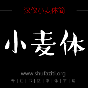
书法字体下载地址
特别提示
1、本站所有资源仅供学习与参考,请勿用于商业用途,否则产生的一切后果由您自己承担!
2、如有侵犯您的版权,请及时联系,请来信978767986#qq.com(请将#换成@发送邮件),我们将尽快处理。