
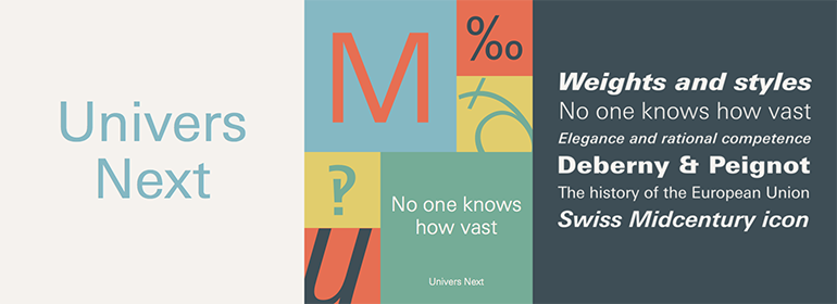

Univers® Next
方正字体说明
Univers® Next.TTF
字体英文名称:zhuan_UniversNextPro-Regular.TTF

Univers® Next
品牌:Linotype(Monotype)
设计师:
Frutiger,Adrian; Linotype Design Studio
发行时间:2010
字库编码:
Unicode
分类:
无衬线体
字体属性:
字体介绍
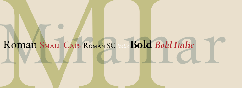
Linotype Univers™是对Adrian Frutiger于1957年设计的Univers字体家族进行的彻底复刻。经过长期艰苦细致的修改,Frutiger和Linotype的设计人员在1997年完成了这个大型的联合项目。结果是: 一个出色且有凝聚力的拥有63种字重和风格(其中包含4个等宽打印机字重)的字体家族。所有的现有字重已被重新绘制,这一过程中特别注意使比例更加一致,并改善诸如曲线及笔画粗细的比例等一些精细的细节。<br>
该家族的字重从27个增加到63个,为平面设计师能够选择自己合适的风格提供了一个更大的机制。为了提高易读性以及适应屏幕上的应用,粗体字重和窄体字重已被重新设计。为了保持每个字体内以及与其他字重的一致性,他们对笔画粗细做了修正。通过遵循Frutiger最初的设计,无衬线体Univers的人文主义特征现在更加明显。数字系统也得到了更新。Univers强健、清晰的字形有利于表达其冷静优雅和理性能力的风格。事实上,所有风格和字重之间的强大的家族关系,对需要功能性和一致性的大型平面设计项目来说,是一个不错的选择。Frutiger成功地实现了最初的目标; 新的Linotype Univers确实适用于较长的文本以及显示设置。<br><br>
<P>Linotype Univers™ is a completely reworked version of the original <a href= ""/font/linotype/univers"">Univers</a> typeface family designed by Adrian Frutiger in 1957. After a long process of painstakingly detailed revision, Frutiger and the design staff at Linotype completed this large joint project in 1997. The result: a brilliant and cohesive font family of 63 weights and styles including the 4 monospaced typewriter weights.</P><P>All of the existing weights were completely redrawn, with careful attention paid to making the proportions more consistent with each other and improving fine details such as curves and thick-to-thin stroke ratios. The family was expanded from 27 to 63 weights, providing a much larger framework to graphic designers for choosing just the right style. The bold and condensed weights were reworked for improved legibility and on-screen application. The stroke weights were revised for consistency within each face as well as in relationship to the other weights. By following Frutiger's original designs, the humanist character of the sans serif Univers now comes through more distinctly.</p><P>The systemized numbering system has also been updated. With its sturdy, clean forms Univers can facilitate an expression of cool elegance and rational competence. In fact, the strong familial relationships between all the styles and weights make it a serviceable choice for large graphic design projects that require versatility with consistency. Frutiger was successful in staying true to his initial aims; the new Linotype Univers does indeed work in longer texts as well as for display settings.</p>
书法字体下载地址
特别提示
1、本站所有资源仅供学习与参考,请勿用于商业用途,否则产生的一切后果由您自己承担!
2、如有侵犯您的版权,请及时联系,请来信978767986#qq.com(请将#换成@发送邮件),我们将尽快处理。