
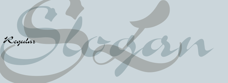


Erbar®
方正字体说明
Erbar®.TTF
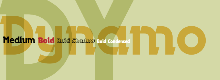
字体英文名称:ErbarCom-BoldCondensed.TTF
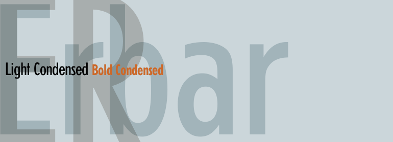
Erbar®
品牌:Linotype(Monotype)
设计师:
Erbar,Jakob
发行时间:2018
字库编码:
Unicode
分类:
无衬线体
字体属性:
字体介绍
Erbar,由德国设计师Jakob Erbar从1922年开始创作,是20世纪20年代第一批也是最受欢迎的新一代几何无衬线体家族之一。在20世纪40年代末和50年代,由于Linotype的复兴,Erbar的细窄版本成为大西洋两岸报纸的主流。今天,Avenir Next和Futura更受欢迎,并且具有更广泛的字重和版本。另一种20世纪二三十年代的无衬线字体W. a . Dwiggins的Metro 家族 (Metrolite、Metromedium和Metroblack)在报界之外鲜为人知,但值得一看。<BR><BR>
Erbar, created from 1922 onward by the German designer Jakob Erbar, was one of the first and most popular of the new gemoetric sans serifs of the 1920s. Revived by Linotype during the late 1940s and 1950s, the more condensed versions of Erbar became mainstays in newspapers on both sides of the Atlantic. Today Avenir Next and Futura are more popular, and available in a wider range of weights and versions. Another sans serif typeface from the 1920s and 30s that is little know outside of the newspaper world, but worth a second glance, is W. A. Dwiggins' Metro family (Metrolite, Metromedium, and Metroblack).
书法字体下载地址
特别提示
1、本站所有资源仅供学习与参考,请勿用于商业用途,否则产生的一切后果由您自己承担!
2、如有侵犯您的版权,请及时联系,请来信978767986#qq.com(请将#换成@发送邮件),我们将尽快处理。