


Scene®
方正字体说明
Scene®.TTF
字体英文名称:AM148___.TTF

Scene®
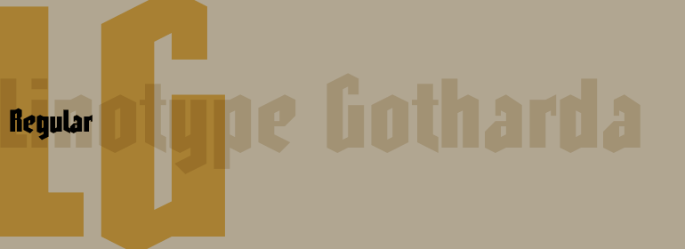
品牌:Monotype
设计师:
Lester,Sebastian
发行时间:2018
字库编码:
Unicode
分类:
无衬线体
字体属性:
字体介绍
Clean. Calm. Highly legible. This is the design brief Sebastian Lester set for himself when he began to create the Scene typeface family.
Knowing that, you'd never guess that Lester's first commercial fonts were alternative" display designs influenced by electronic gaming and house music. Lester began his career after graduating with honors from Central Saint Martins College of Art and Design in London. He spent several years designing for the music and games industries and dabbling in 3D animation. Then, in 2000, he joined Monotype Imaging, where he creates fonts for both on-screen and print uses. "I've always had a deep interest in type and typography," says Lester, "but when I began creating text typefaces for Monotype Imaging, I gained new insight into the subtleties of letterform design."
Work on Scene began after Lester had developed several corporate identity fonts for Monotype Imaging. He wanted to provide graphic designers and creative directors with a suite of fonts that would serve as a strong foundation for identity projects. He also wanted to incorporate what he'd learned about achieving best on-screen and print legibility. Much of the Scene family's clarity lies in an x-height that sits comfortably between that of Helvetica and Verdana. Full-bodied counters, long ascenders and descenders, and exceptionally well-drawn letters also play their parts. Lester took special care with letter spacing and kerning to ensure optimal typographic color at any size.
Scene is the result of two years of after-hours and weekend work. "It started off as a part-time project," says Lester, "but ended up as virtually a second full-time job." The completed family is six weights with complementary italic designs. Also included is a set of "semi-sans" characters that introduce more expressive word rhythms into headlines and blocks of copy. In addition, aligning and old style numerals were drawn for all six weights.
"I'm very pleased with this font family," beams Lester. "I believe I've created a strong yet subtle communication tool that has much to offer designers working in corporate identity and other areas of design." We wholeheartedly agree."
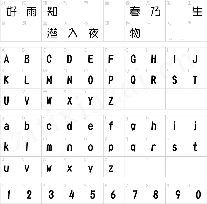
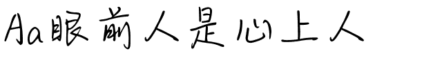
书法字体下载地址
特别提示
1、本站所有资源仅供学习与参考,请勿用于商业用途,否则产生的一切后果由您自己承担!
2、如有侵犯您的版权,请及时联系,请来信978767986#qq.com(请将#换成@发送邮件),我们将尽快处理。