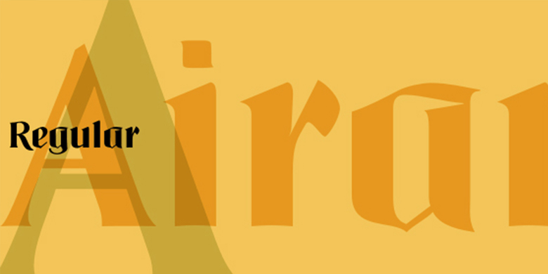


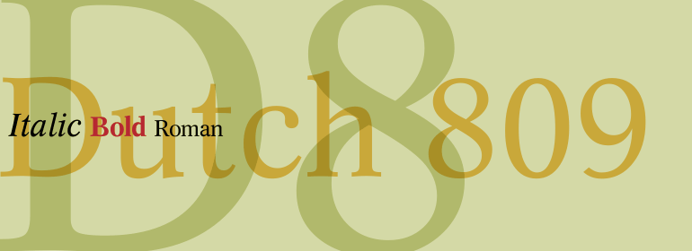


Linotype Projekt™
方正字体说明
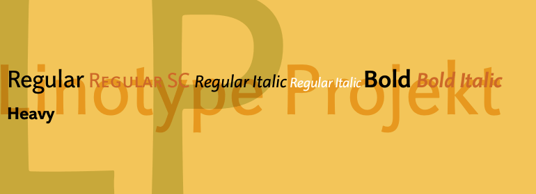
Linotype Projekt™.TTF
字体英文名称:LT_54718.TTF
Linotype Projekt™
品牌:Linotype(Monotype)
设计师:
Koch,Andreas
发行时间:2018
字库编码:
Unicode
分类:
无衬线体、正文字体
字体属性:
字体介绍
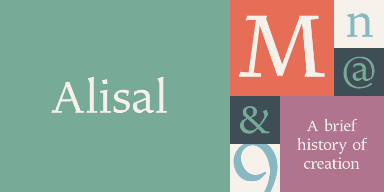
Linotype Projekt是由德国字体设计师Andreas Koch创作,具有明确的灵感和目标。我突然意识到像Helvetica和Univers这样的字体在铸字排版中似乎比用现代数字排版的质量更高。他们更强大、更活泼。一部分归因于将字符压在纸上的打印过程,另一部分原因归于字母的形式,这些字形与同一字体的PostScript版本有所不同。印刷的一个重要方面是由于压力而导致的字符宽度略有增加,这也可以作为对形式的视觉校正。(真正的正方形看上去有点像桶状。)我想恢复这种特殊性,不是因为怀念,而是因为它更具吸引力。结果就有了Linotype Projekt,一款清晰和谐、易读性极高的文本字体,Koch生活在德国的比勒费尔德,是书籍与字体方面的自由设计师。”
<BR><BR>
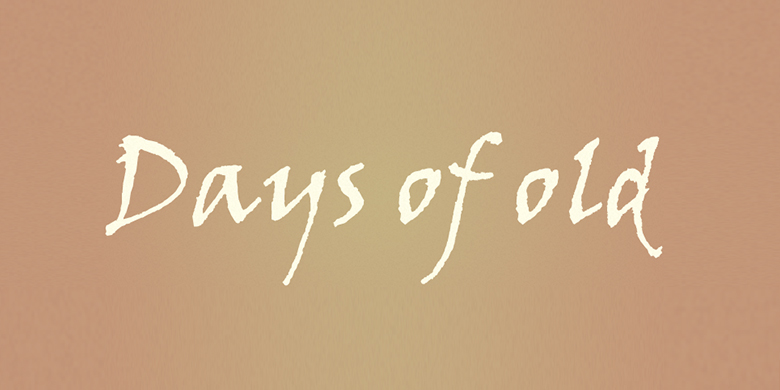
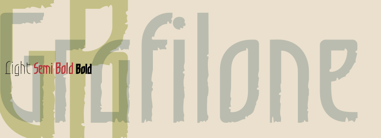
Linotype Projekt was created by German type designer Andreas Koch with both a well-defined inspiration and goal. It occurred to me that typefaces like Helvetica and Univers seemed to have a higher quality in hot-metal composition as with modern digital typesetting. They are stronger and livelier. This is in part due to the printing process, which presses the characters onto paper, and in part to the forms of the letters, which differ from the PostScript version of the same typeface. An important aspect of printing is the slight increase in character width resulting from the pressure which also serves as an optical correction to the forms. (True exact squares appear slightly barrel-formed to the eye.) I wanted to revive this peculiarity, not because of a nostalgic feeling, rather just because it is more attractive." The result is Linotype Projekt, a text font which is harmonious, clear and extremely legible. Koch lives in Bielefeld, Germany, and is a freelance book and type designer."
书法字体下载地址
特别提示
1、本站所有资源仅供学习与参考,请勿用于商业用途,否则产生的一切后果由您自己承担!
2、如有侵犯您的版权,请及时联系,请来信978767986#qq.com(请将#换成@发送邮件),我们将尽快处理。