


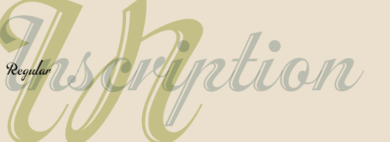


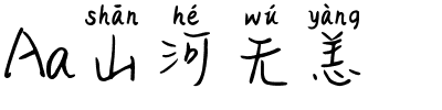


ITC Quay Sans®
方正字体说明
ITC Quay Sans®.TTF
字体英文名称:QuaySansITCCom-Medium.TTF
ITC Quay Sans®
品牌:ITC(Monotype)
设计师:
Quay,David
发行时间:2018
字库编码:
Unicode
分类:
无衬线体、正文字体
字体属性:
字体介绍
伦敦的设计师David Quay于1990年设计了ITC Quay Sans。自从20世纪90年代以来,功能主义的欧洲无衬线字体一直是字体设计的主导力量,而ITC Quay sans的前身之一就是基于19世纪的Grotesk字体比例设计的。Grotesk,德语为无衬线字体,定义了无衬线运动的整个分支,该运动于20世纪50年代以Helvetica字体的设计达到了顶峰。<br>
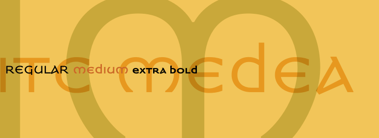
ITC Quay Sans是由非常简单清晰的字母组成。整个字母表中的笔画字重都大同小异。每个尾端最后都微微张开,为设计增加了一点层次。这有助于防止千篇一律,当在一大段文本中重复出现无数个单一字重的笔画字母时,就很危险。ITC Quay Sans是一款非常易读的字体。它的所有尺寸表现良好。<br>
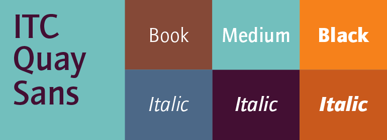
ITC Quay Sans字体有六种字重可供选择:Book,Book Italic,Medium,Medium Italic,Black和Black Italic。ITC Quay Sans与Hans Eduard Meier的Syntax以及Tim Ahrens的Linotype Aroma类似。”<br><br>
London-based designer David Quay designed ITC Quay Sans in 1990. One of the precursors to the long run of functionalist European sans serif faces that has been a dominating force in type design since the 1990s, ITC Quay sans is based on the proportions of 19th Century Grotesk faces. Grotesk, the German word for sans serif, defines an entire branch of the sans serif movement, which culminated in the 1950s with the design of Helvetica.
<br>
ITC Quay Sans is made up of very simple, legible letters. The weights of the strokes throughout the alphabet vary very little. Microscopic flares on the ends of each terminal add a bit of dimension to the design. This helps prevent the onset of the monotony, a danger when one repeats countless near mono-weight stroked letters throughout a large body of text. ITC Quay Sans is a very readable face; it works equally well in all sizes.
<br>
Six fonts of the ITC Quay Sans typeface are available: Book, Book Italic, Medium, Medium Italic, Black, and Black Italic. ITC Quay Sans is similar to Hans Eduard Meier's Syntax, and Tim Ahrens' Linotype Aroma."
书法字体下载地址
特别提示
1、本站所有资源仅供学习与参考,请勿用于商业用途,否则产生的一切后果由您自己承担!
2、如有侵犯您的版权,请及时联系,请来信978767986#qq.com(请将#换成@发送邮件),我们将尽快处理。