
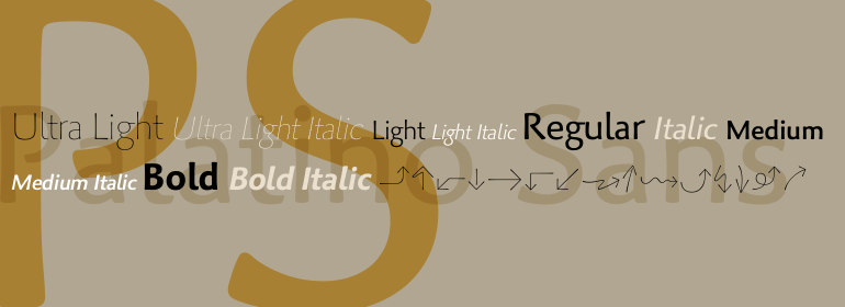


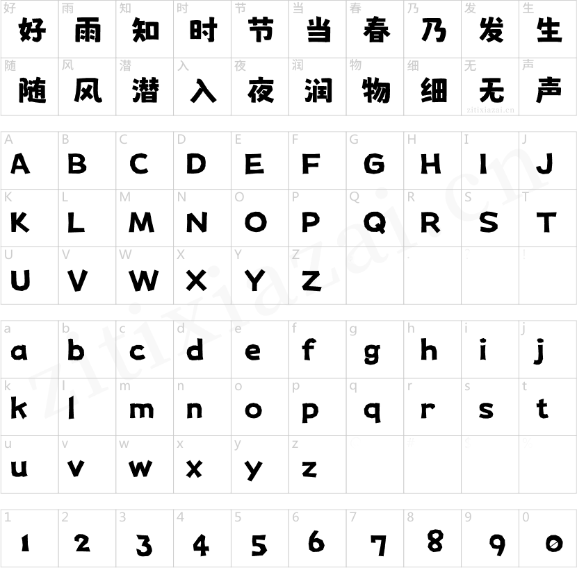


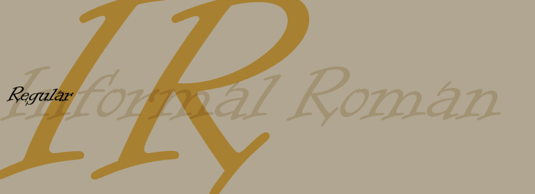

Neuzeit® Office
方正字体说明
Neuzeit® Office.TTF
字体英文名称:NeuzeitOffice-Regular.TTF

Neuzeit® Office
品牌:Linotype(Monotype)
设计师:
Kobayashi,Akira
发行时间:2018
字库编码:
Unicode
分类:
无衬线体、正文字体
字体属性:
字体介绍
每年,越来越多的文本都是直接在办公应用的计算机屏幕上阅读,或者从复印机或激光打印机打印出的纸张上阅读。如今清晰、易读的字体在办公室通信中比以往任何时候都重要。然而,每个员工都希望在公司里有一点个性。大多数办公环境仅配备了几种基本字体,这些字体经过优化可用于文本、激光打印机和屏幕上。<br>
Linotype Office Alliance字体可确保数据清晰度。每个字体家族的所有字体粗细都具有相同的字符尺寸;个别字母或单词的样式可以在不影响自动换行的情况下做改变!所有数字、数学符号和货币符号均为表格形式;它们具有相同的字符设置宽度,从而确保没有什么可以能妨碍图形、图表和表格设计的清晰。除了非常开放和清晰之外,该家族字体中的字符还具有相同的大写字母高度和相同的x高度。Linotype Office Alliance字体适当地简化了财务报告的制作和阅读。 <br>
Neuzeit Office家族是按照原始的无衬线家族Neuzeit S的模型设计的,它是由D. Stempel AG和Linotype Design Studio于1966年生产。Neuzeit S本身是对D. Stempel AG的DIN Neuzeit的重新设计,由Wilhelm Pischner于1928年至1939年期间创作。<br>
为了代表自己的时代,DIN Neuzeit一定能奏响和谐的乐章。DIN Neuzeit是一款建构的几何无衬线字体。它诞生于20世纪20年代,这是一个设计试验和标准化的时代,它的精神因包豪斯(Bauhaus)和德斯蒂吉尔(De Stijl)运动而闻名于艺术、建筑和设计领域。<br>
在20世纪60年代重新将其设计为Neuzeit S时,考虑了无衬线字母设计的其他发展。Neuzeit S的几何感看起来不那么明显,反而更具哥特式或工业化的风格。它具有双层的a,而不是不太清晰的单层变体,这使它与Futura之类的字体区别开来。与诸如Helvetica这种很受欢迎的怪诞无衬线字体不同,Neuzeit S尤其是经过重新设计的Neuzeit Office包含了更开放、清晰的字母。Neuzeit Office保留了多年来与其设计相关的典型数字形式。经过40年的发展,Neuzeit再次被重新设计,且现在比以往任何时候都新颖。<br>
Linotype的字体设计主管Akira Kobayashi于2006年修订并更新了Neuzeit Office。他最大的改变是改进了设计,使其在文本中的表现更加理想。此外,他还创作了其同伴斜体以强调文本。
Office Alliance系统中的其他三个家族包括Metro Office,Times Europa Office和Trump Mediaeval Office。Neuzeit Office的某些字重可作为柔和圆润的版本。 ”<br><br>
Every year, more and more text is read directly on a computer screen in office applications, or from freshly printed sheets from a copier or laser printer. Clear, legible text faces are more imperative to office communication than ever before. Yet every worker desires a small bit of personality in the corporate world. Most office environments are only equipped with a few basic fonts that are truly optimized for use in text, with laser printers, and on screen.<br>
The Linotype Office Alliance fonts guarantee data clarity. All of the font weights within the individual family have the same character measurements; individual letters or words may have their styles changed without line wrap being affected! All numbers, mathematical signs, and currency symbols are tabular; they share the same set character width, ensuring that nothing stands in the way of clear graph, chart, and table design. In addition to being extremely open and legible, the characters in this collection's fonts also share the same capital letter height and the same x-height. The production and reading of financial reports is duly streamlined with the Linotype Office Alliance fonts. <br>
The Neuzeit Office family is designed after the model of the original sans serif family Neuzeit S, which was produced by D. Stempel AG and the Linotype Design Studio in 1966. Neuzeit S itself was a redesign of D. Stempel AG's DIN Neuzeit, created by Wilhelm Pischner between 1928 and 1939. <br>
Intended to represent its own time, DIN Neuzeit must have struck a harmonious chord. DIN Neuzeit is a constructed, geometric sans serif. It was born during the 1920s, a time of design experimentation and standardization, whose ethos has been made famous by the Bauhaus and De Stijl movements in art, architecture, and design. <br>
书法字体下载地址
特别提示
1、本站所有资源仅供学习与参考,请勿用于商业用途,否则产生的一切后果由您自己承担!
2、如有侵犯您的版权,请及时联系,请来信978767986#qq.com(请将#换成@发送邮件),我们将尽快处理。