


ITC Merss™
方正字体说明
ITC Merss™.TTF
字体英文名称:MERSSITC.TTF

ITC Merss™
品牌:ITC(Monotype)
设计师:
Manso,Eduardo
发行时间:2018
字库编码:
Unicode
分类:
字体属性:
字体介绍
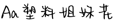
ITC Merss证明有时候意外也会有好的结果。一天晚上,阿根廷平面及字体设计师Eduardo Manso把咖啡洒到了办公桌上。在收拾残局的时候,他注意到其中一个水珠看起来像是罗马字母“l”——带有衬线。这激发了他的想象力。“如果一个完整的字母表也是按照这种不规则的流程设计出来的呢?ITC Merss是Manso对“流动的”字母形状进行实验的结果。这个奇特的设计看起来既古老又自然。其不规则的纹理令人惊叹——是对字符形状精心建模的结果。Manso想要保持液体洒落后的自由形式特征,他也知道单个字母必须在潜在的和谐下协同工作。当不尝试字体或洒落的咖啡时,Manso会创造了屡获殊荣的图形和出版物设计。作为设计杂志《el Huevo》(the Egg)的撰稿人,他还撰写有关字体和排印的文章,并且是该出版物设计团队的一员。 <br><br>
ITC Merss proves that sometimes accidents work out just fine. Late one evening Eduardo Manso, an Argentinean graphic and type designer, spilled coffee on his desk. When he began to wipe up the mess, he noticed that one of the splashes looked like a roman letter 'l' - complete with serifs. This triggered his imagination. “What if a complete alphabet was created with this same irregular flow to the character designs?” ITC Merss was the result of Manso's experiments with “fluid” letter shapes. The oddly handsome design looks aged and spontaneous at the same time. Its irregular texture is striking-the result of careful modeling of character shapes. While Manso wanted to maintain the free-form character of spilled liquid, he also knew the individual letters had to work together with an underlying harmony. When not experimenting with typefaces - or spilled coffee - Manso creates award-winning graphic and publication designs. A contributor to the design magazine el Huevo (the Egg), he also writes articles on type and typography and is part of the publication's design team.
书法字体下载地址
特别提示
1、本站所有资源仅供学习与参考,请勿用于商业用途,否则产生的一切后果由您自己承担!
2、如有侵犯您的版权,请及时联系,请来信978767986#qq.com(请将#换成@发送邮件),我们将尽快处理。