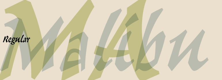
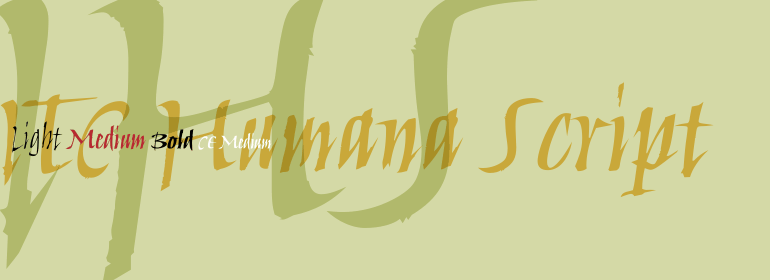
Meridien®
方正字体说明
Meridien®.TTF
字体英文名称:MeridienCom-Roman.TTF
Meridien®
品牌:Linotype(Monotype)
设计师:
Frutiger,Adrian
发行时间:2018
字库编码:
Unicode
分类:
衬线体、正文字体
字体属性:
字体介绍
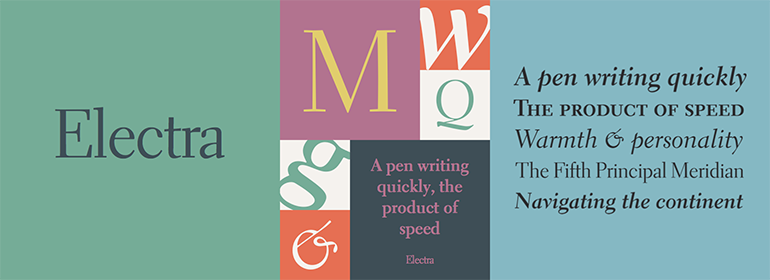
Meridien是于1950年代中期开发的,并由法国铸造厂Deberny&Peignot于1957年发布。在研究了16世纪的字体之后,瑞士设计师Adrian Frutiger受到启发,创作了一个完全没有垂直笔画的字母表,他希望以该字体设置的文本在读者阅读的时候有种在森林中漫步的感觉。Frutiger设计了100多种字体,但他认为Meridien是最好的一款。 Meridien略微展开的主干(stem),三角形的衬线,使其既尖锐、优雅、迷人,而又给人以美感;很像森林。当您想要在书籍文本中创建一种独特的图形表达时,请使用罗马字重。对于海报及网站,斜体或粗体,甚至是全部设置为大写的罗马字重都能给人一种庄重肃穆的印象。 <br><br>
Meridien was developed in the mid-1950s, and released by the French foundry Deberny & Peignot in 1957. After studying a typeface from the sixteenth century, the Swiss designer Adrian Frutiger was inspired to create an alphabet without any completely straight strokes, and he hoped the reader of a text set in this typeface would feel as though wandering through a forest. The designer of more than 100 typefaces, Frutiger considers Meridien to be his best. With its slightly flared stems and triangular shaped serifs, Meridien is at once sharp, graceful, arresting, and sensuous; much like a forest. Use the roman when you want to create a distinctive graphic expression in book text. For posters and websites, the italic or the bold weights or even the roman set in all caps will give an impression of quiet dignity.
书法字体下载地址
特别提示
1、本站所有资源仅供学习与参考,请勿用于商业用途,否则产生的一切后果由您自己承担!
2、如有侵犯您的版权,请及时联系,请来信978767986#qq.com(请将#换成@发送邮件),我们将尽快处理。