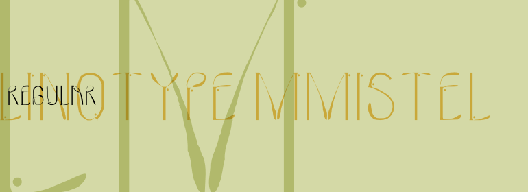


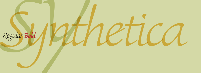


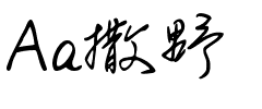


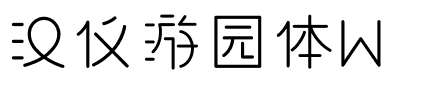


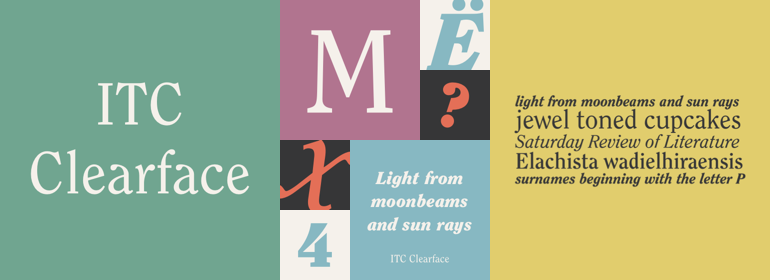
ITC Clearface®
方正字体说明
ITC Clearface®.TTF
字体英文名称:IT527___.TTF
ITC Clearface®
品牌:ITC(Monotype)
设计师:
Caruso,Victor
发行时间:2018
字库编码:
Unicode
分类:
衬线体
字体属性:
字体介绍
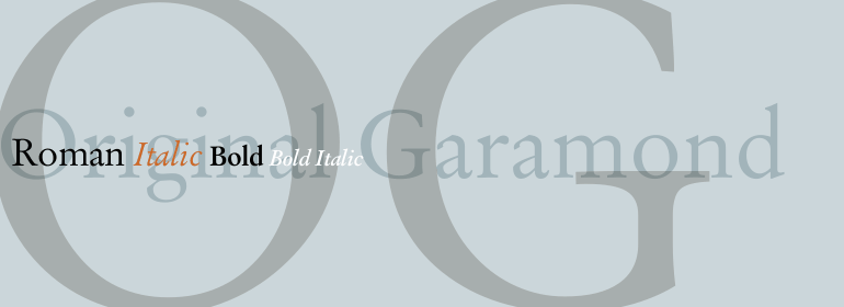
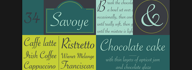
Clearface字体最初是由Morris Fuller Benton于1907年设计。它们的形式展现了20世纪初的时代精神(Zeitgeist)。典型且明显的特征是“ a”和“ k”的字形。ATF版本不包含附带的斜体。<br>
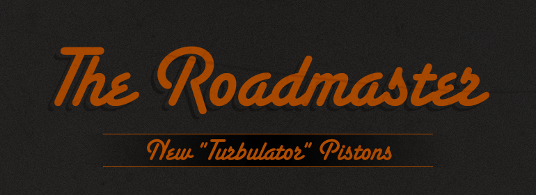
1978年,ITC的Victor Caruso获得ATF的许可,允许其基于Clearface的字形开发一种新的衬线字体以及与其配套的斜体。于是就有了ITC Clearface,一款具有明显的笔画对比和斜体字重的衬线字体。小写字母a、c和f泪珠形的结尾(也可以在Caslon中找到)定义了该字体的特征。该字体的设计还有几个明显特征是其小型(几乎是平板)衬线、较高的x高度以及不太明显的笔画对比。ITC Clearface具有历史感,既适合文本也适合标题,但其略微细窄的特点使其在限定的范围内效果最好。<br><br>
The Clearface types were originally designed by Morris Fuller Benton in 1907. Their forms expressed the Zeitgeist of the turn of the 20th century; typical and distinguishing characteristics are the forms of the a" and the "k." The ATF version did not include an accompanying Italic.<br>
In 1978, ITC's Victor Caruso was licensed by ATF to develop a new serif typeface and matching italic based on the forms of Clearface. The result was ITC Clearface, a serif typeface with marked stroke contrast and italic weights. The teardrop-formed endings of the lowercase a, c and f (also found in Caslon) define the character of the face. The type's design is also distinguished by its small -- almost slab -- serifs, a large x-height, and little stroke contrast. ITC Clearface, with its historical touch, is good for both texts and headlines, but its slightly condensed nature performs at its best when it is allowed its space.
书法字体下载地址
特别提示
1、本站所有资源仅供学习与参考,请勿用于商业用途,否则产生的一切后果由您自己承担!
2、如有侵犯您的版权,请及时联系,请来信978767986#qq.com(请将#换成@发送邮件),我们将尽快处理。