


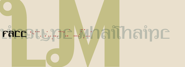


Iridium®
方正字体说明
Iridium®.TTF
字体英文名称:LT_54428.TTF
Iridium®
品牌:Linotype(Monotype)
设计师:
Frutiger,Adrian
发行时间:2018
字库编码:
Unicode
分类:
衬线体、正文字体
字体属性:
字体介绍
Iridium™由Adrian Frutiger于1972年为Linotype设计。它是现代风格的Bodoni或Didot,因为它是粗细对比度高和匀称的字重分布所创造的火花。但是,现代风格有时会显得粗糙而僵硬,而Frutiger的优美诠释则缓和了这一点。Iridium本身是一种非常坚硬、易碎且坚固的金属;然而,这个词的拉丁语和希腊语词根是彩虹的意思。事实上,这种字体比一般的现代字体更有光泽和更有复杂的感觉——注意从腰部到衬线的细度,圆角漂亮的椭圆形,以及衬线的轻微托衬。Iridium最初是用于照排的,Frutiger本人用手亲自切割。这个数字版本拥有原始版本的所有工艺,包括罗马字体、真正的斜体和粗体。Iridium对于书籍、杂志文字和标题特别有用。”<br><br>
Iridium™ was designed by Adrian Frutiger in 1972 for Linotype. It is in the modern" style like Bodoni or Didot, in that it has the sparkle created by a high thick/thin contrast and a symmetrical distribution of weight. But the sometimes harsh and rigid texture of the modern style is tempered by Frutiger's graceful interpretation. Iridium itself is a very hard, brittle and strong metal; yet the Latin and Greek roots of the word mean rainbow, or iridescence. And indeed, this font is infused with a more lustrous and complex spirit than the average rather stark modern typeface - note the stems that gently taper from waist to serif, the nicely curved ovals of the round characters, and the slight bracketing of the serifs. Iridium was originally designed for phototypesetting, and Frutiger himself cut the final master photo-mask films by hand. This digital version has all the craftsmanship of that original and includes the roman, a true italic, and the bold weight. Iridium works particularly well for book and magazine text and headlines."
书法字体下载地址
特别提示
1、本站所有资源仅供学习与参考,请勿用于商业用途,否则产生的一切后果由您自己承担!
2、如有侵犯您的版权,请及时联系,请来信978767986#qq.com(请将#换成@发送邮件),我们将尽快处理。