


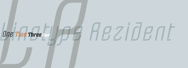


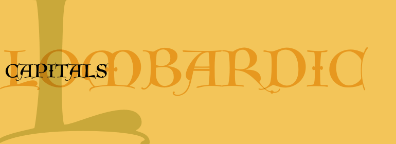


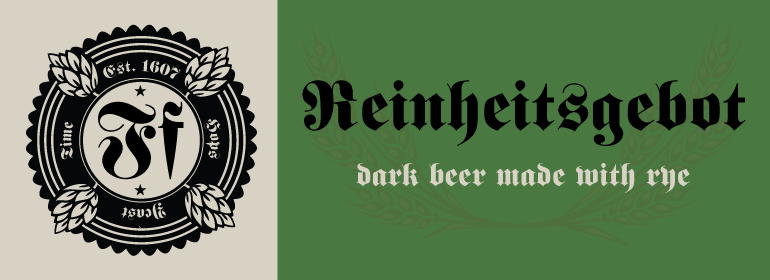
Fette Fraktur™
方正字体说明
Fette Fraktur™.TTF
字体英文名称:FetteFrakturCom.TTF
Fette Fraktur™
品牌:Linotype(Monotype)
设计师:
Linotype Design Studio
发行时间:2018
字库编码:
Unicode
分类:
哥特体
字体属性:
字体介绍
Fette Fraktur由德国C.E. Weber字体厂商于1875年发行。这是一款特殊的基于哥特风格的字体,适用于需要强烈对比或是特定时期的任务中。它提供了一个与中世纪的黑色字体有关历史氛围。顾名思义,Fette Fraktur外观粗厚。Fette Fraktur的字号应该设置在18pt以上才能确保更好的可读性和高质量的输出,因为非常粗的笔划和非常细的笔划之间有很高的对比度,而这些笔划都被最大化了。Fette Fraktur是Linotype GmbH的一个商标,已在某些区域注册过。
<br>
Fette Fraktur was issued by the C.E. Weber foundry in Germany in 1875. This is specific Gothic-based lettering suitable for jobs where extreme contrast or specific period should be evoked. Nevertheless, the rendering is sophisticated and offers an historic atmosphere as would be associated with the Black Lettering of the Middle Ages. As the name suggests, Fette Fraktur has a fat, broken appearance. The Fette Fraktur font should be set in sizes over 18pt to ensure better legibility and quality output, due to the high contrast between the very thick and the very thin strokes which have been maximized. Fette Fraktur is a trademark of Linotype GmbH and may be registered in certain jurisdictions.
书法字体下载地址
特别提示
1、本站所有资源仅供学习与参考,请勿用于商业用途,否则产生的一切后果由您自己承担!
2、如有侵犯您的版权,请及时联系,请来信978767986#qq.com(请将#换成@发送邮件),我们将尽快处理。