

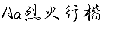


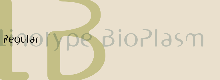

Finnegan®
方正字体说明
Finnegan®.TTF
字体英文名称:FinneganLTCom-Regular.TTF
Finnegan®
品牌:Linotype(Monotype)
设计师:
Weltin,Jürgen
发行时间:2018
字库编码:
Unicode
分类:
无衬线体、正文字体
字体属性:
字体介绍
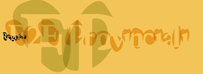
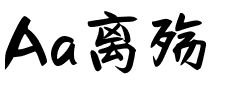
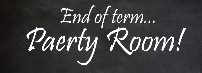
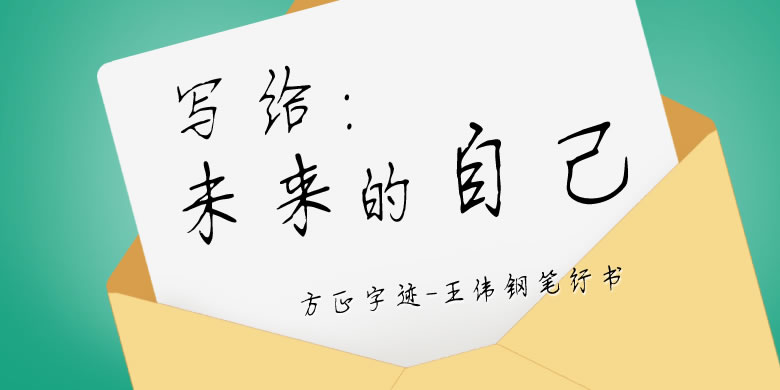
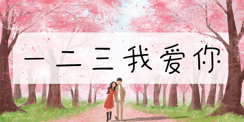
德国设计师Jürgen Weltin设计了Linotype Finnegan,这是一种植根于文艺复兴时期人文主义字体的现代文本设计。由于在书写中可辨识的书写轨迹是从左上到右下,Weltin在他的设计中模仿了这一点:Linotype Finnegan的上下笔画以多余的衬线结尾。所有的粗笔画都有锥度;水平笔画和曲线明显比垂直笔画细。这种动态的特性为Linotype Finnegan提供了个性与力量的结合,以及高度的多样性。<br>
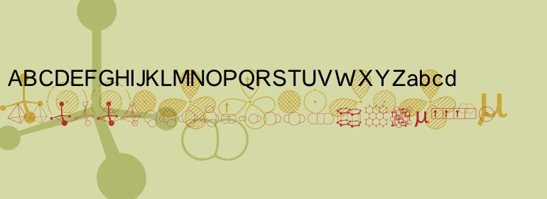
Linotype Finnegan是一款全新的、独特的字体。它以其极高的易读性、独创性以及形式上的卓越性而与众不同。即使是不间断地阅读较长文本,Linotype也可以让其变得有趣。然而,字体永远不能因为要过于突出其本身而把人们的注意力从文本内容上转移开。 <br><br>
German designer Jürgen Weltin designed Linotype Finnegan, a modern text design with roots in the humanist letterforms of the Renaissance. As the recognizable direction of movement in writing runs from upper left to lower right, Weltin mimicked this in his design: Linotype Finnegan's up and down strokes end in residual serifs. All of the thick strokes have a taper; horizontal strokes and curves are noticeably thinner than the verticals. This dynamic nature lends a combination of individualness and energy, along with a high degree of variety, to Linotype Finnegan.<br>
Linotype Finnegan is a wholly new and unique typeface. It distinguishes itself through its extreme legibility, originality, and formal excellence. Linotype Finnegan makes fun to read longer texts non-stop. However, the typeface never distracts the attention from the text's content by forcing itself too much into the foreground.
书法字体下载地址
特别提示
1、本站所有资源仅供学习与参考,请勿用于商业用途,否则产生的一切后果由您自己承担!
2、如有侵犯您的版权,请及时联系,请来信978767986#qq.com(请将#换成@发送邮件),我们将尽快处理。