
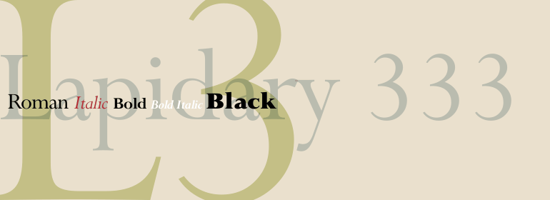


Caslon #540
方正字体说明
Caslon #540.TTF
字体英文名称:lte50227.TTF
Caslon #540
品牌:Linotype(Monotype)
设计师:
American Type Founders
发行时间:2018
字库编码:
Unicode
分类:
衬线体
字体属性:
字体介绍
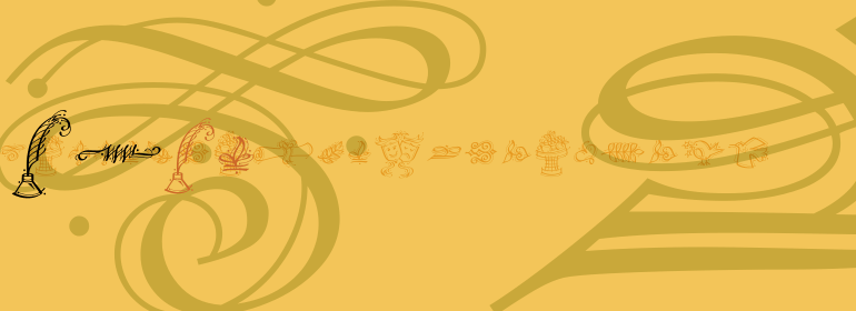
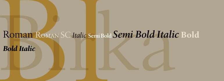
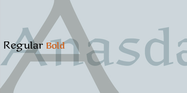
英国人William Caslon从1720年到1766年去世,切割了许多罗马、斜体和非拉丁字体。当时大部份字体是从荷兰传入英国的,所以Caslon受到了荷兰特征的影响。然而,他确实达到了一定的水平,使他成为公认的第一个伟大的英国设计师。Caslon变得如此流行,以至于被称为国王手记,尽管在政治范围(和海洋)的另一端,美国人在1776年的《独立宣言》中使用了它。长久以来,原始的Caslon为各种以他的名字命名的字体提供了丰富的来源。大多数Caslons的识别特征包括带有尖顶的大写字母A;带有两个完整衬线的大写字母C;斜体字是斜体小写的v和w。Caslon的字体在印刷商中享有传奇的地位,被认为是安全和可靠的。<br><br>
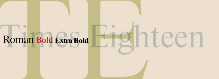
20世纪早期的许多解释中,有一些是真实的,并且足够强大以至于最后进入数字时代。其中包括两个American Type Founders公司的Caslon 540和稍重的Caslon 3号。这两种字体都比较宽,并配有小型大写字母、老式图形和斜体。Caslon Open Face第一次出现是在1915年的Barnhart Bros & Spindler Foundry公司,尽管名字叫Caslon,但与真正的Caslon字体完全不同。它专门用于标题和首字母缩写,并且无论是与更正宗的Caslon字体结合使用还是单独使用,都显得优雅。<br><br>
The Englishman William Caslon punchcut many roman, italic, and non-Latin typefaces from 1720 until his death in 1766. At that time most types were being imported to England from Dutch sources, so Caslon was influenced by the characteristics of Dutch types. He did, however, achieve a level of craft that enabled his recognition as the first great English punchcutter. Caslon's roman became so popular that it was known as the script of kings, although on the other side of the political spectrum (and the ocean), the Americans used it for their Declaration of Independence in 1776. The original Caslon specimen sheets and punches have long provided a fertile source for the range of types bearing his name. Identifying characteristics of most Caslons include a cap A with a scooped-out apex; a cap C with two full serifs; and in the italic, a swashed lowercase v and w. Caslon's types have achieved legendary status among printers and typographers, and are considered safe, solid, and dependable.
<br><br>
A few of the many interpretations from the early twentieth century were true to the source, as well as strong enough to last into the digital era. These include two from the American Type Founders Company, Caslon 540 and the slightly heavier Caslon #3. Both fonts are relatively wide, and come complete with small caps, Old style Figures, and italics. Caslon Open Face first appeared in 1915 from the Barnhart Bros & Spindler Foundry, and is not anything like the true Caslon types despite the name. It is intended exclusively for titles, headlines and initials, and looks elegant whether used with the more authentic Caslon types or by itself.
书法字体下载地址
特别提示
1、本站所有资源仅供学习与参考,请勿用于商业用途,否则产生的一切后果由您自己承担!
2、如有侵犯您的版权,请及时联系,请来信978767986#qq.com(请将#换成@发送邮件),我们将尽快处理。