


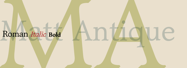


Monotype Bodoni™
方正字体说明
Monotype Bodoni™.TTF
字体英文名称:BOD_CI.TTF

Monotype Bodoni™
品牌:Monotype
设计师:
Monotype Design Studio
发行时间:2018
字库编码:
Unicode
分类:
衬线体
字体属性:
字体介绍
Bodoni意味着工业革命的开始;它的衬线是平滑的直衬线,而应力始终是在垂直笔画上。Bodoni主张有足够的留白,所以它的下伸部很长。M相当窄;在Q的尾巴先是垂直下降的,而R的尾巴则是卷曲的。像大多数欧洲大陆的现代字体一样,斜体也有罗马衬线。<br><br>
Monotype Bodoni由于其简单性而显得轮廓非常清晰。它的翻印效果很好,尤其是尺寸超过12pt时。该字体比Bauer Bodoni稍黑。这样的对比使Monotype Bodoni显得更加细窄。<br><br>
Bodoni expresses the beginning of the Industrial Revolution; its serifs are flat, think and unbracketed, while the stress is always on the mathematically vertical strokes. Bodoni believed in plenty of white space and therefore descenders are long. The M is rather narrow; in the Q the tail at first descends vertically and the R has a curled tail. The italic, like most continental modern faces, has roman serifs.
<br><br>
Monotype Bodoni provides a clear-cut effect due to its simplicity. It reproduces well, particularly in sizes over 12pt. This font is slightly darker than Bauer Bodoni. The contrast makes Monotype Bodoni appear more condensed.
书法字体下载地址
特别提示
1、本站所有资源仅供学习与参考,请勿用于商业用途,否则产生的一切后果由您自己承担!
2、如有侵犯您的版权,请及时联系,请来信978767986#qq.com(请将#换成@发送邮件),我们将尽快处理。