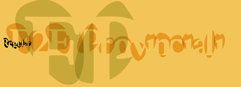


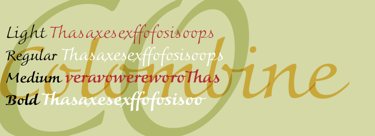

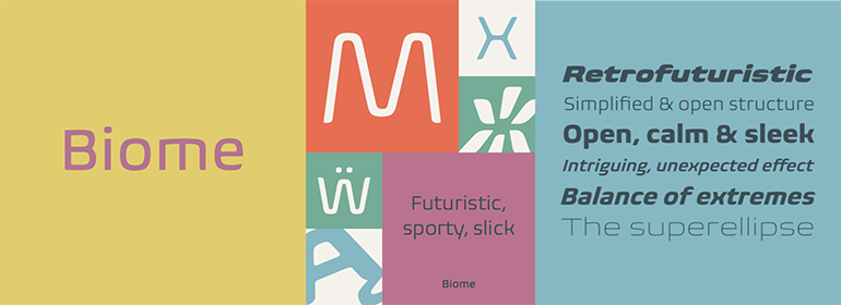
Biome™
方正字体说明
Biome™.TTF
字体英文名称:BiomePro-ExtraLight.TTF
Biome™
品牌:Monotype
设计师:
Crossgrove,Carl
发行时间:2018
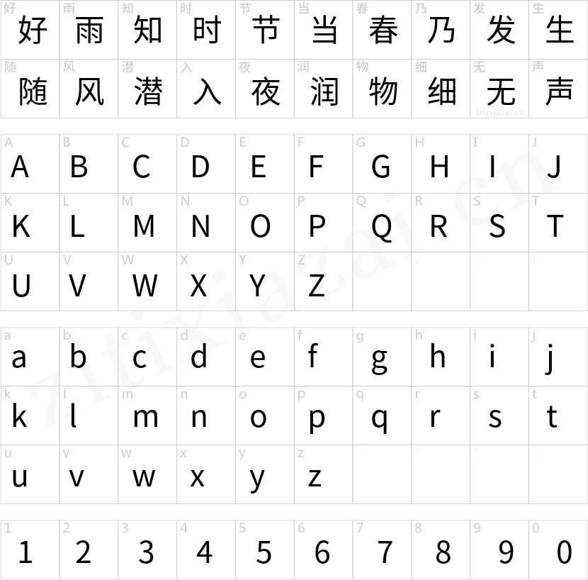
字库编码:
Unicode
分类:
衬线体、无衬线体
字体属性:
字体介绍
Biome™ by Carl Crossgrove is a striking and individual typeface that has a vast spectrum of potential uses. Its shapes combine elements of biomorphism with minimalist elements and the humanist tradition of font design. This hyperfamily with its 42 variants is not only at home in print design projects, but is the perfect webfont for internet sites. _x000D_
This typeface bears the name 'Biome', and biome is a term that is also used to designate a kind of ecosystem. Like these ecoregions, which represent a perfectly coordinated system of an immense number of factors, Biome is also a symbiosis of various experimental aspects and influences that were combined in a long drawn-out design process. The starting point for this process was Crossgrove's ambivalent attitude towards the futuristic design movements of the mid-20th century. He was fascinated by the minimalism and biomorphism of this era but, at the same time, repelled by the overly ascetic and rational elements. As a consequence, he began to look for a way to merge humanist, biomorphic and minimalist features in what, in his words, is a form of organic modernism". _x000D_
In the sketches that formed the basis for his typeface Biome, Crossgrove experimented with inner and outer shapes in different styles, adapted letters to the form of the superellipse, and added curves only to remove these again. His challenge was to find a harmonious and coherent approach that provided sufficient contrast with existing fonts. _x000D_
Biome is essentially in the sans serif tradition and the letters exhibit only minor variations in terms of line thickness. There is still a suggestion of the superellipse at many points, but this never becomes the predominant design factor. While most of the terminals of the vertical strokes are only slightly rounded, the horizontals and diagonals have pronounced arches and it is these that basically determine the round and soft character of the typeface. _x000D_
The more unconventionally shaped letters, such as the lowercase 'g' with its two semi-open counters and the 'k' and 'x' with their crossbars, provide Biome with an individual personality. And this effect is emphasised by the generously rounded links in the 'v' and 'w' and the uppercase 'M' and 'N'._x000D_
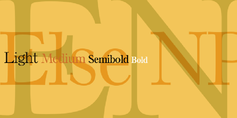
Biome has been designed as a typeface hyperfamily. From the near hairline Extra Light to the amply proportioned Ultra, there are seven clearly differentiated weights and three tracking widths. There are oblique italic versions of all variants. The range includes small caps and numeral sets containing lowercase and uppercase digits. With its available range of characters, Biome can be used to set texts in all Eastern European languages._x000D_
Although the remarkable individuality of Biome is most clearly apparent in the larger point sizes, this typeface is not just suitable for producing headlines and logos. Biome's elegant visual effects mean that it is equally comfortable in short texts while its large x-height and generous counters make it readily legible even in the small font sizes. Biome is a contemporary typeface that employs mid-20th century futurist elements which ironically give it a retro feel."
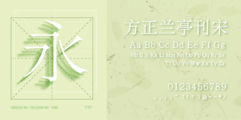
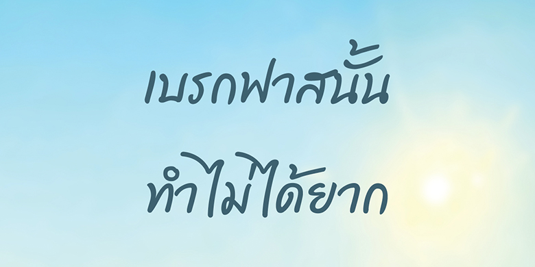
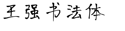
书法字体下载地址
特别提示
1、本站所有资源仅供学习与参考,请勿用于商业用途,否则产生的一切后果由您自己承担!
2、如有侵犯您的版权,请及时联系,请来信978767986#qq.com(请将#换成@发送邮件),我们将尽快处理。