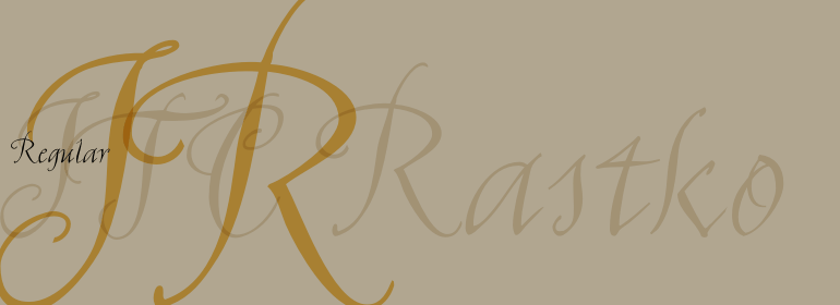


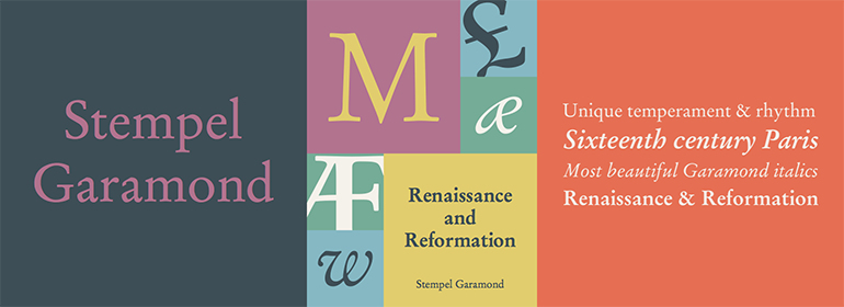
Stempel Garamond™
方正字体说明
Stempel Garamond™.TTF
字体英文名称:StempelGaramondLTPro-Roman.TTF
Stempel Garamond™
品牌:Linotype(Monotype)
设计师:
D. Stempel AG
发行时间:2018
字库编码:
Unicode
分类:
字体属性:
字体介绍
16世纪上半叶,Claude Garamond(约1480-1561年)为巴黎学者印刷商Robert Estienne刻字,其罗马体是根据Francesco Griffo在1495年为威尼斯印刷商Aldus Manutius切割的字体而设计的。Garamond在后来的版本中完善了其罗马体,随着他作为字冲雕刻师技能的提高,其中也加入了他自己的理念。在他1561年去世后,Garamond冲床被搬到了位于安特卫普的Christoph Plantin的印刷办公室,在这里被Plantin使用了数十年,至今仍保存于Plantin-Moretus博物馆中。Garamond的其他冲床都进入了Egenolff-Berner的法兰克福铸造厂,Egenolff-Berner于1592年发布了一个样本,成为后来的学者和设计师了解有关Garamond字体的一个重要的信息来源。1621年,即Garamond逝世六十年后,法国印刷商Jean Jannon(1580-1635)发行了一种字体样本,它的特征与Garamond设计类似,但是其字母的斜度和轴线更加不对称且不规则。Jannon的字体销声匿迹了大约200年,但1825年在法国国家印刷局被重新发现,当时它们被错误地认为是Claude Garamond。直到1927年Beatrice Warde的研究才揭示了它们的真正起源。20世纪早期,Jannon的字体被用来印刷一本法国的印刷史,这使人们重新注意到法国排印和Garamond字体。这激发了现代复兴的开始。一些基于Jannon字体的错误模型,而另一些则基于原始的Garamond字体。Garamond字体的斜体有时是基于Robert Granjon (1513-1589)切割的字体,Robert Granjon创作过Plantin,而且他的字体也在Egenolff-Berner的样本上。Linotype有多个Garamond版本的字体。虽然它们在设计和原型上各不相同,但它们均被视为法国文艺复兴时期风格的独特代表;它们的优雅和可读性都很易于识别。<br>
Stempel Garamond™最早由D. Stempel AG于1925年首次发布,它是基于1592年的Egenolff-Berner样本,因此是真正的Garamond字体的复兴。它是对Garamond最著名的诠释之一,自1925年问世以来,它一直都是最常用的文本字体之一。Stempel Garamond具有自己独特的气质,其节奏和清晰度使它与其他的Garamonds区分开来。Stempel Garamond™有多种字重,包括小型大写字母,老式数字以及中欧字符。<br><br>
Claude Garamond (ca. 1480-1561) cut types for the Parisian scholar-printer Robert Estienne in the first part of the sixteenth century, basing his romans on the types cut by Francesco Griffo for Venetian printer Aldus Manutius in 1495. Garamond refined his romans in later versions, adding his own concepts as he developed his skills as a punchcutter. After his death in 1561, the Garamond punches made their way to the printing office of Christoph Plantin in Antwerp, where they were used by Plantin for many decades, and still exist in the Plantin-Moretus museum. Other Garamond punches went to the Frankfurt foundry of Egenolff-Berner, who issued a specimen in 1592 that became an important source of information about the Garamond types for later scholars and designers. In 1621, sixty years after Garamond's death, the French printer Jean Jannon (1580-1635) issued a specimen of typefaces that had some characteristics similar to the Garamond designs, though his letters were more asymmetrical and irregular in slope and axis. Jannon's types disappeared from use for about two hundred years, but were re-discovered in the French national printing office in 1825, when they were wrongly attributed to Claude Garamond. Their true origin was not to be revealed until the 1927 research of Beatrice Warde. In the early 1900s, Jannon's types were used to print a history of printing in France, which brought new attention to French typography and the Garamond"" types. This sparked the beginning of modern revivals; some based on the mistaken model from Jannon's types, and others on the original Garamond types. Italics for Garamond fonts have sometimes been based on those cut by Robert Granjon (1513-1589), who worked for Plantin and whose types are also on the Egenolff-Berner specimen. Linotype has several versions of the Garamond typefaces. Though they vary in design and model of origin, they are all considered to be distinctive representations of French Renaissance style; easily recognizable by their elegance and readability.
<br>
First released by D. Stempel AG in 1925, Stempel Garamond™ was based on the Egenolff-Berner specimen of 1592 and was therefore a revival of the genuine Garamond types. It is one of the most famous Garamond interpretations, and since its introduction in 1925, it has been one of the most frequently used text fonts. Stempel Garamond has its own unique temperament, with a rhythm and sharpness that set it apart from other Garamonds. Stempel Garamond™ is available in several weights with small caps, Old style Figures, and Central European characters.
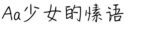
书法字体下载地址
特别提示
1、本站所有资源仅供学习与参考,请勿用于商业用途,否则产生的一切后果由您自己承担!
2、如有侵犯您的版权,请及时联系,请来信978767986#qq.com(请将#换成@发送邮件),我们将尽快处理。