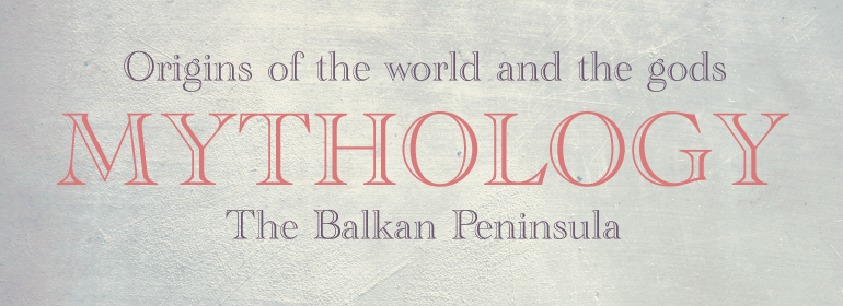


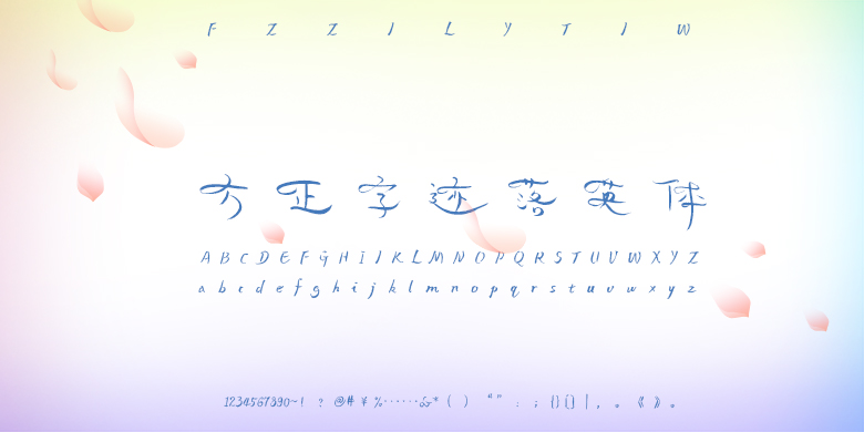

ITC Officina® Serif
方正字体说明
ITC Officina® Serif.TTF
字体英文名称:OfficinaSerifITCPro-Book.TTF
ITC Officina® Serif
品牌:ITC(Monotype)
设计师:
Spiekermann,Erik; Schäfer,Ole
发行时间:2018
字库编码:
Unicode
分类:
字体属性:
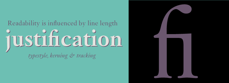
字体介绍
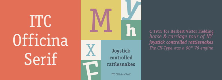
当ITC Officina于1990年首次发布时,它是由衬线字体和无衬线字体组成的配对家族。以两个斜体字为字重,旨在作为商务信函的常用字体。但事实证明,这种字体在很多领域都比通信更受欢迎。ITC Officina的设计师Erik Spiekermann说:“一旦ITC Officina被潮流引领者用来表示‘酷’,它就失去了它的纯真。再也不用假装它只需要两个字重就能处理办公室信件了。”作为杂志和广告使用字体,它需要适当的标题字重以及在原始Book和Bold之间再增加一个字重。Spiekermann与MetaDesign的排印和字体设计总监Ole Schaefer共同合作来增添新的字重和小型大写字母。现在,扩展后的ITC Officina家族包括Medium、Extra Bold和Black三种字重以及与其匹配的斜体(无论是Sans还是Serif),还有新小型大写字母字体的原始Book和Bold字重。
<br>
When ITC Officina was first released in 1990, as a paired family of serif and sans serif faces in two weights with italics, it was intended as a workhorse typeface for business correspondence. But the typeface proved popular in many more areas than correspondence. Erik Spiekermann, ITC Officina's designer: Once ITC Officina got picked up by the trendsetters to denote 'coolness,' it had lost its innocence. No pretending anymore that it only needed two weights for office correspondence. As a face used in magazines and advertising, it needed proper headline weights and one more weight in between the original Book and Bold."" To add the new weights and small caps, Spiekermann collaborated with Ole Schaefer, director of typography and type design at MetaDesign. The extended ITC Officina family now includes Medium, Extra Bold, and Black weights with matching italics-all in both Sans and Serif -- as well as new small caps fonts for the original Book and Bold weights.
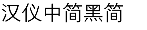
书法字体下载地址
特别提示
1、本站所有资源仅供学习与参考,请勿用于商业用途,否则产生的一切后果由您自己承担!
2、如有侵犯您的版权,请及时联系,请来信978767986#qq.com(请将#换成@发送邮件),我们将尽快处理。