


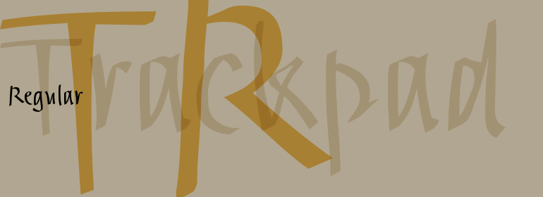


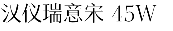


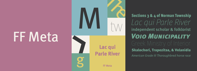
FF Meta®
方正字体说明
FF Meta®.TTF
字体英文名称:MetaPro.TTF
FF Meta®
品牌:FontFont(Monotype)
设计师:
Spiekermann,Erik
发行时间:2018
字库编码:
Unicode
分类:
字体属性:
字体介绍
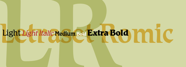
One of the most famous and popular typefaces of the FontFont library is Meta®, designed by Erik Spiekermann. Since 1991, when the first styles were published, the font has developed into a super family with numerous variants.The basic shape of FF Meta is based on Renaissance Antiqua and has a corresponding, slight variation in the stroke width. Beveled stroke ends and the partially curved lines in particular lend Meta a distinctive, lively and friendly character, which is further supported by the round points. The two-story "g", which is very striking and has become a kind of trademark of the font, was adapted from the Antiqua. Meta is also perfectly legible in the small font sizes, not in the least because of the large x-height and open letter forms. FF Meta is now available in two widths with six condensed weights and eight normal weights. All styles have a true italic with their own letter forms and are perfectly equipped typographically. You have the option of small capitals, different number sets, numerous and in some cases very particular ligatures and alternate characters.If the vivid and detailed structures of FF Meta prove to be a little too dominant in headlines and larger font sizes, FF Meta® Headline is the ideal choice. Under the direction of Erik Spiekermann and Christian Schwartz, Joshua Darden designed three widths, each with four weights for the compact font, optimizing it for larger sizes. To this end, he not only cut back the curved lines, but also shortened slightly the descenders and reduced the letter-spacing. Alternate characters with a reduced form for "a", "g" and "l" offer you more leeway.FF Meta® Correspondence is designed specifically for the requirements of the office environment. Not only did a few letters get a more solid form, such as the lowercase "i" and "j" or the uppercase "I" and "Q", but other characters, such as "f", "E" and "F", have been optimized for better screen display, dispensing with the oblique ends. The small "g" is available in the single-story form, although the two-story version, typical to the Meta font, is also included. FF Meta Correspondence also contains numerous symbols and pictograms for everyday office work.It took Erik Spiekermann, collaborating with Christian Schwartz and Kris Sowersby, three years to design FF Meta® Serif. The approach was not to cling obsessively to the basic shape of FF Meta, but rather to create a serif that was fitting for the font. As a result, the Renaissance Antiqua FF Meta Serif is in perfect harmony with FF Meta in terms of its weights and x-height. It embraces the style of its sister font so as to be optically perfect, not mathematically exact. All six weights of FF Meta Serif Italic feature real italic styles and can be combined with the FF Meta on the same page or in the same line.
书法字体下载地址
特别提示
1、本站所有资源仅供学习与参考,请勿用于商业用途,否则产生的一切后果由您自己承担!
2、如有侵犯您的版权,请及时联系,请来信978767986#qq.com(请将#换成@发送邮件),我们将尽快处理。