

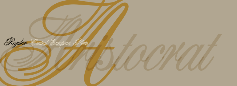

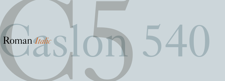

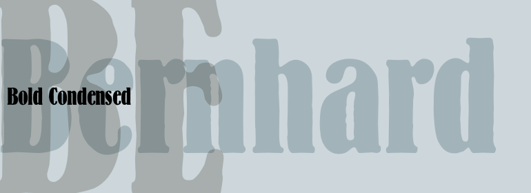
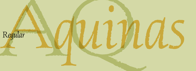
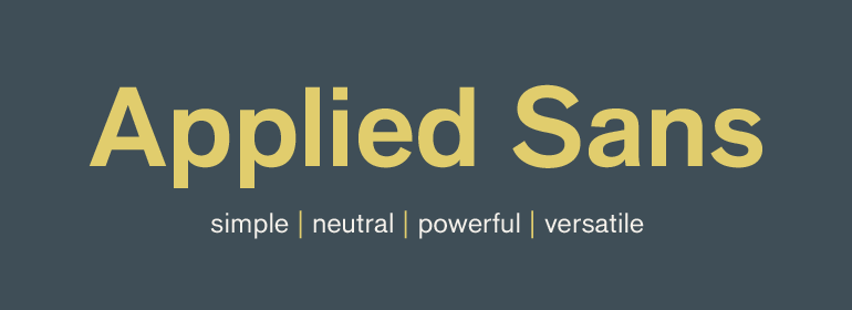


DIN® Next Slab
方正字体说明
DIN® Next Slab.TTF
字体英文名称:DINNextSlabPro-Regular.TTF
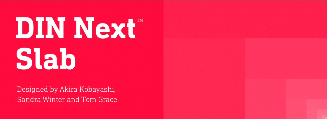
DIN® Next Slab
品牌:Monotype
设计师:
Kobayashi,Akira; Winter,Sandra; Grace,Tom
发行时间:2018
字库编码:
Unicode
分类:
字体属性:
字体介绍
如今,倍受欢迎的DIN Next有更多的设计可能性。凭借其技术和中性特征,DIN Next在当代排印中获得了永久的地位。现在,DIN Next Slab进一步扩展了该字体家族,提供了新的设计潜力。<br>
接下来的DIN Next Slab,也是在Akira Kobayashi的指导下创作的。在Sandra Winter和Tom Grace的团队中,Kobayashi根据DIN Next的优化形状创建新的字体变体。扩展将使流行的字体更加灵活和多样化。除此之外,几何粗衬线突出了字体的技术和形式特征,并强调了DIN Next的中心设计元素。<br>
但是,该团队确实需要克服一些挑战。虽然将DIN Next Light与粗衬线体联系起来相对容易一些,可当使用Black样式时可用空间的大小很快就没有了。Winter解释说,为了在空间、字母和衬线形状之间找到折衷方案,必须进行许多测试和试验。修改字重或仅单侧衬线对比度的实验很快就被放弃了。字体的主要特点、技术特征以及强大特性都有很大的变化。不过,还可以略微简化一些字母的形状,例如'k'或'x'。为了使字体具有一致的外观,这些变化(最初是以Black样式开发的)被应用于所有字重。
<br>
与DIN Next一样,DIN Next Slab也包含了从Ultralight到Black的七个字重,且每个字重都有其相应的斜体。所有样式都有各种各样的字符集,以及四个中等的粗细都有可用的小型大写字母。
<br>
DIN Next Slab与DIN Next的样式非常协调:基本字形和字重相同。两种版本的字体都可以完美地协同工作,不仅可以在标题和正文中使用,还可以在文本中使用。通过新的DIN Next Slab,Monotype可以持续扩展DIN Next超级家族。使用DIN Next Slab,您不仅可以在标题中,甚至也可以在文本中强调字体的技术特性和形式特征。如此一来,由于DIN Next的不同风格完美地结合在一起,您就可以用于更多新的、多样化的应用。
<br><br>
Now even more design possibilities with the popular DIN Next. With its technical and neutral character, DIN Next has earned a permanent place in contemporary typography. Now, DIN Next Slab expands the font family further, offering new design potential.
<br>
Now comes the next step, DIN Next Slab, also produced under the direction of Akira Kobayashi. On a team with Sandra Winter and Tom Grace, Kobayashi is creating the new font variant based on the optimized shapes of DIN Next. The expansion will make the popular font all the more flexible and versatile. Apart from that, the geometric slab serifs underline the technical and formal nature of the font and emphasize a central design element of DIN Next.
<br>
However, the team did have some challenges to overcome. While it is relatively easy to imagine DIN Next Light with slab serifs, the amount of available space quickly disappears when it comes to the Black styles. Winter explains that many tests and trials were necessary to find a compromise between space, letters and the serif shapes. Experiments with modified contrast in the weight or only one-sided serifs were quickly abandoned. The central, technical and powerful character of the font changed too much. Nevertheless, it was necessary to simplify slightly the shape of some letters, such as the ‘k’ or ‘x’, for example. These changes, first developed in the Black styles, were applied to all weights in order to lend the font a consistent appearance.
<br>
Like DIN Next, DIN Next Slab also has seven weights, which cover the range from Ultralight to Black, each with matching italic. There are various character sets in all of the styles and the four middle weights have small capitals available.
<br>
DIN Next Slab harmonizes perfectly with the styles of DIN Next: the basic letterforms and weights are identical. Both versions of the font can work together perfectly, not just in headlines and body text, but also within a text; they complement each other very well as design variations. With the new DIN Next Slab, Monotype expands the DIN Next super family consistently. With DIN Next Slab, you can underscore the technical and formal nature of the understated font not only in headlines, but in texts, as well. In this way, you have new and diverse potential for application, thanks to the way the different styles of DIN Next combine perfectly.
书法字体下载地址
特别提示
1、本站所有资源仅供学习与参考,请勿用于商业用途,否则产生的一切后果由您自己承担!
2、如有侵犯您的版权,请及时联系,请来信978767986#qq.com(请将#换成@发送邮件),我们将尽快处理。