


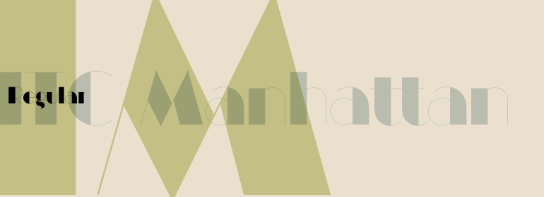
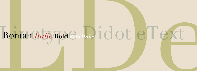
Linotype Didot™ eText
方正字体说明
Linotype Didot™ eText.TTF
字体英文名称:DidotETPro-Regular.TTF
Linotype Didot™ eText
品牌:Linotype(Monotype)
设计师:
Frutiger,Adrian; Linotype Design Studio
发行时间:2018
字库编码:
Unicode
分类:
字体属性:
字体介绍
在大约100年的18和19世纪,Didot家族的几个成员作为设计师活跃在巴黎。他们也是印刷者、出版者、打字者、发明家、作家和知识分子。1800年左右,Didot家族拥有法国最重要的印刷厂和字体铸造厂。Pierre Didot出版了由他的兄弟Firmin Didot设计和剪裁的字体排版的书籍和印刷品。Didot字母的雕琢的、清晰的形式是那个时代的代表,与意大利同一时期的Giambattista Bodoni设计的非常相似。这些字体被称为“现代”风格——意味着它们的特点是极高的垂直应力和精细的发际线,与粗线条的主要笔画形成对比。Linotype Didot™由Adrian Frutiger于1991年绘制,基于Firmin Didot在1799年到1811年间切割的字体。在1818年由Didots出版的一本书《La Henriade》中,Frutiger也研究了Didot的字体。这个漂亮的家庭有12个字重,包括老式数字、一个标题版本,和精美的图形装饰。Linotype Didot是书籍和杂志设计的最佳选择,也是广告的最佳选择。
eText fonts - the optimum of on-screen text quality
With our new eText fonts that have been optimised for on-screen use, you can ensure that your texts remain readily legible when displayed on smartphones, tablets or e-readers.
The poor resolution of many digital display systems represents a major challenge when it comes to presenting text. It is necessary to make considerable compromises, particularly in the case of text in smaller point sizes, in order to adapt characters designed in detail using vector graphics to the relatively crude pixel grid. So-called 'font hinting' can help with this process. This, for example, provides the system with information on which lines are to be displayed in a particular thickness, i.e. using a specific number of pixels.
As font hinting is a largely manual and thus very complex technique, many typefaces come with only the most necessary information. What is unimportant for a text printed in high resolution can result in a poor quality image when the same text is displayed on a screen, so that reading it rapidly becomes a demanding activity.
Specially optimised eText fonts can help overcome this problem. An extremely refined and elaborate font hinting system makes sure that these fonts are optimally displayed on screens. Monotype has not only adopted font hinting for this purpose but has also thoroughly reworked the fonts to hone them for display in low resolution environments. For example, the open counters present in the letters C, c, e, S, s, g etc. have been slightly expanded so that these retain their character even in small point sizes. Also with a view to enhancing appearance in smaller point sizes, line thickness has been discreetly increased and x-height carefully adjusted. Kerning has also been modified.
Don't leave the on-screen appearance of your creations to chance. Play it safe and use eText fonts to achieve perfect results on modern display devices. Many typefaces, including many popular classics, are already available as eText fonts and new ones are continually being published.
The eText font you can purchase here are available for use as Desktop Fonts or Web Fonts. Should they be used in Mobile Devices such as smartphones, tablets or eReaders, please contact our OEM specialists at sales-eu@monotype.com. "
书法字体下载地址
特别提示
1、本站所有资源仅供学习与参考,请勿用于商业用途,否则产生的一切后果由您自己承担!
2、如有侵犯您的版权,请及时联系,请来信978767986#qq.com(请将#换成@发送邮件),我们将尽快处理。