


Bembo®
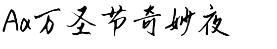
方正字体说明
Bembo®.TTF
字体英文名称:BemboMTPro-Regular.TTF
Bembo®
品牌:Monotype
设计师:
Monotype Design Studio
发行时间:2018
字库编码:
Unicode
分类:
字体属性:
字体介绍
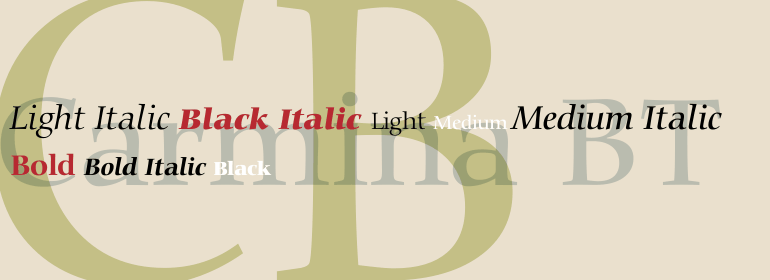
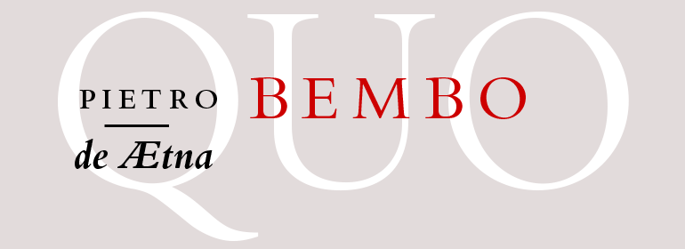
Bembo的起源可以追溯到意大利文艺复兴时期最著名的印刷商之一Aldus Manutius。1496年,他使用一种新的罗马字体来印刷了著名作家Pietro Bembo撰写的游记《de Aetna》。这种字体由Francesco Griffo设计,他是一位多产的雕刻家,是最早摆脱人文主义书法中的粗线条而发展成我们今天所认为的罗马风格外观的人之一。1929年,Stanley Morison和Monotype公司的设计人员将Griffo的罗马字体进行复刻设计出一款新的字体,将其命名为Bembo。他们对15世纪的字母进行了许多修改,以使这个字体更适合于机器排版。斜体是基于文艺复兴时期的抄写员Giovanni Tagliente所切割的字母。由于Bembo不张扬而且优雅稳定,较细的字重在书籍排版中很受欢迎。较粗的字重使广告和包装项目有一种保守可靠的感觉。Bembo具有31个粗细,包括小型大写字母、老式数字、丰富的字符以及一个可替代的大写字母R,它是一个出色的通用的字体家族。<br><br>
The origins of Bembo go back to one of the most famous printers of the Italian Renaissance, Aldus Manutius. In 1496, he used a new roman typeface to print the book de Aetna, a travelogue by the popular writer Pietro Bembo. This type was designed by Francesco Griffo, a prolific punchcutter who was one of the first to depart from the heavier pen-drawn look of humanist calligraphy to develop the more stylized look we associate with roman types today. In 1929, Stanley Morison and the design staff at the Monotype Corporation used Griffo's roman as the model for a revival type design named Bembo. They made a number of changes to the fifteenth-century letters to make the font more adaptable to machine composition. The italic is based on letters cut by the Renaissance scribe Giovanni Tagliente. Because of their quiet presence and graceful stability, the lighter weights of Bembo are popular for book typography. The heavier weights impart a look of conservative dependability to advertising and packaging projects. With 31 weights, including small caps, Old style figures, expert characters, and an alternate cap R, Bembo makes an excellent all-purpose font family.
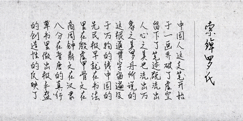
书法字体下载地址
特别提示
1、本站所有资源仅供学习与参考,请勿用于商业用途,否则产生的一切后果由您自己承担!
2、如有侵犯您的版权,请及时联系,请来信978767986#qq.com(请将#换成@发送邮件),我们将尽快处理。