


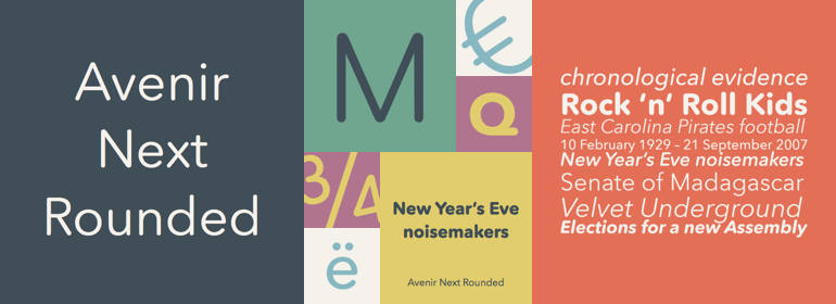
Avenir® Next Rounded
方正字体说明
Avenir® Next Rounded.TTF
字体英文名称:AvenirNextRoundedPro-Reg.TTF
Avenir® Next Rounded
品牌:Linotype(Monotype)
设计师:
Frutiger,Adrian; Kobayashi,Akira
发行时间:2018
字库编码:
Unicode
分类:
字体属性:
字体介绍
Adrian Frutiger于1988年设计了Avenir™,他对无衬线字体有多年的兴趣。在接受Linotype的采访时,他说他觉得有义务设计出一种线性的sans字体,既要遵循Erbar和Futura的传统,又要利用20世纪的经验和风格的发展。单词Avenir在法语中的意思是“未来”, 并暗示该字体应归功于Futura。但与Futura不同的是,Avenir不是纯粹的几何图形;它的垂直笔划比水平笔划粗,一个“o”不是一个完美的圆,还有缩短的上升笔划。这些细微的差别有助于可读性,并为Avenir的文字和标题提供了和谐而合理的外观。Avenir™ Next是一个Platinum Collectionfont家族,最近发布,是对现有Avenir的重大改进和扩展。它包括新的小型大写字母,新设计的真正斜体,和一个完整的细窄字重。Avenir™Next是一个多功能的无衬线字体家族,适用于从书籍到标识,再到广告的大型复杂项目。<BR><BR>
Adrian Frutiger designed Avenir™ in 1988, after years of having an interest in sans serif typefaces. In an interview with Linotype, he said he felt an obligation to design a linear sans in the tradition of Erbar and Futura, but to also make use of the experience and stylistic developments of the twentieth century. The word Avenir means 'future' in French and hints that the typeface owes some of its interpretation to Futura. But unlike Futura, Avenir is not purely geometric; it has vertical strokes that are thicker than the horizontals, an """"o"""" that is not a perfect circle, and shortened ascenders. These nuances aid in legibility and give Avenir a harmonious and sensible appearance for both texts and headlines. Avenir™ Next is a Platinum Collectionfont family, recently released as a major improvement and extension to the existing Avenir. It includes new small caps, newly designed true italics, and a complete new range of condensed weights. Avenir™ Next is a versatile sans serif family, ready for large and complex projects from books to signage to advertising.
书法字体下载地址
特别提示
1、本站所有资源仅供学习与参考,请勿用于商业用途,否则产生的一切后果由您自己承担!
2、如有侵犯您的版权,请及时联系,请来信978767986#qq.com(请将#换成@发送邮件),我们将尽快处理。